Start with strategic clarity. Add fearless creativity. Watch what happens next.
Energy & Technology
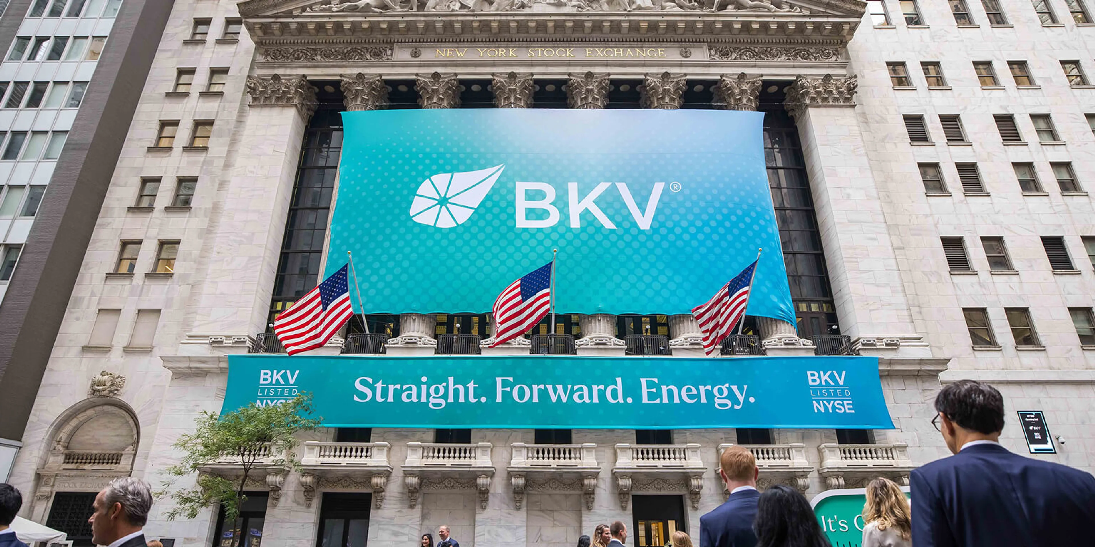
BKV IPO: Switching on BKV’s next chapter.

Manufacturing & Industrial
Dräger Fire: A breath of fresh ID for the world’s most comfortable SCBA.

Strategic Consultancy
Baker & O’Brien: Branding a deep reservoir of advisory experience.

Oil & Gas
BP: Giving wellness a healthy dose of energy.

Wellness
The Preserve: Restoration found betwixt nature and fitness.

Professional Services
Lyndsay Bray Coaching Group: Industrial-strength estrogen, professionally applied.

Oil & Gas
Nine Energy Service: On a scale of one to ten, we made a perfect difference.
Energy & Technology
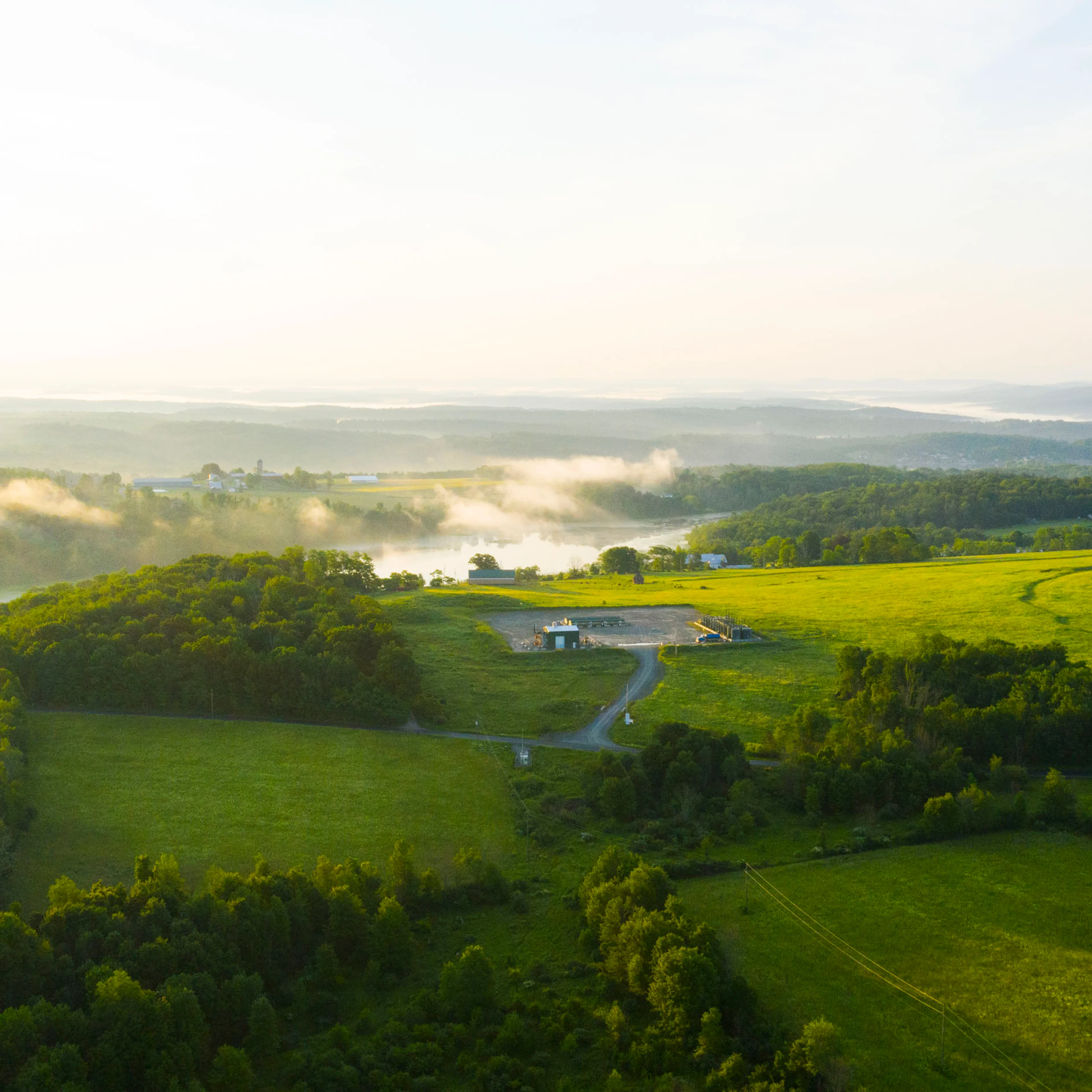
Paving the way for carbon-neutral natural gas.
Nonprofit
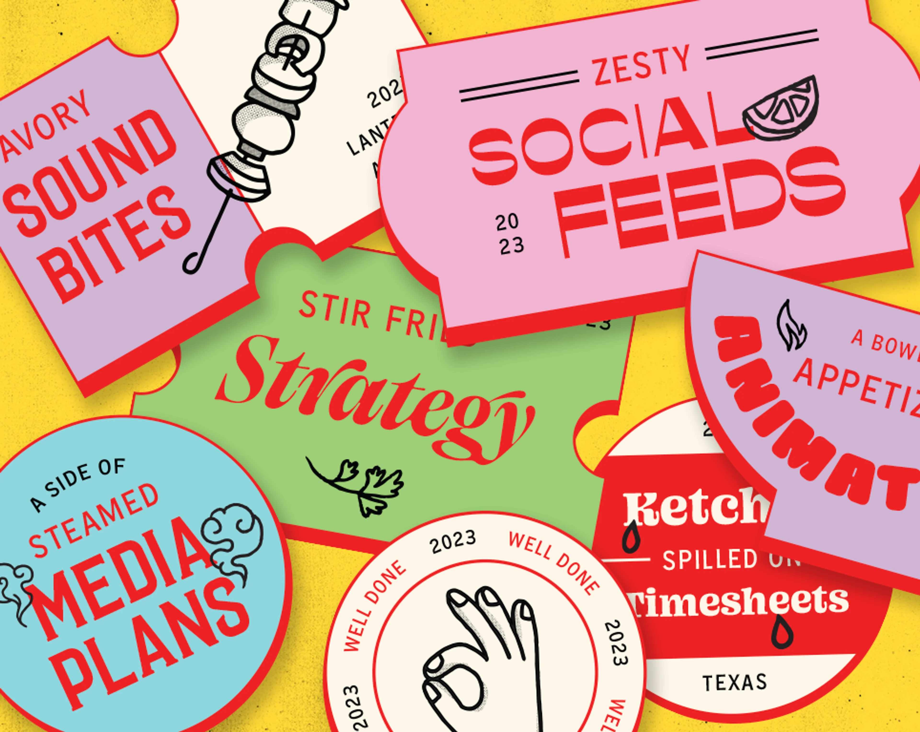
HBMA Lantern Awards: How a B2B event promotion can be rare and well done.
Energy & Technology
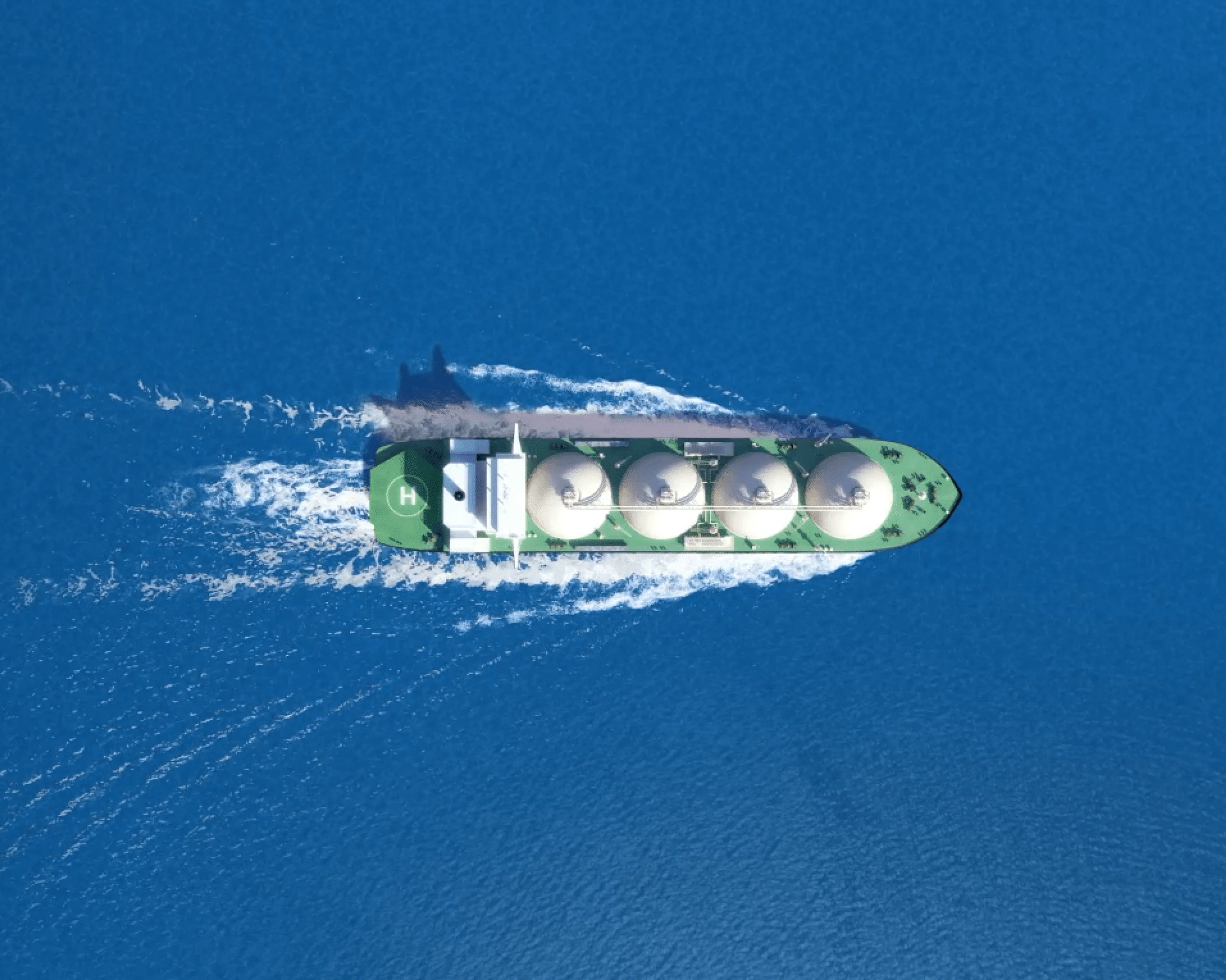
Cheniere: When the country’s largest LNG producer needed some brand energy.

Financial Services
Doeren Mayhew: Getting an accounting firm to think outside the spreadsheets.

Healthcare
HIPS: Making absurdly disproportional impact for healthcare innovators.
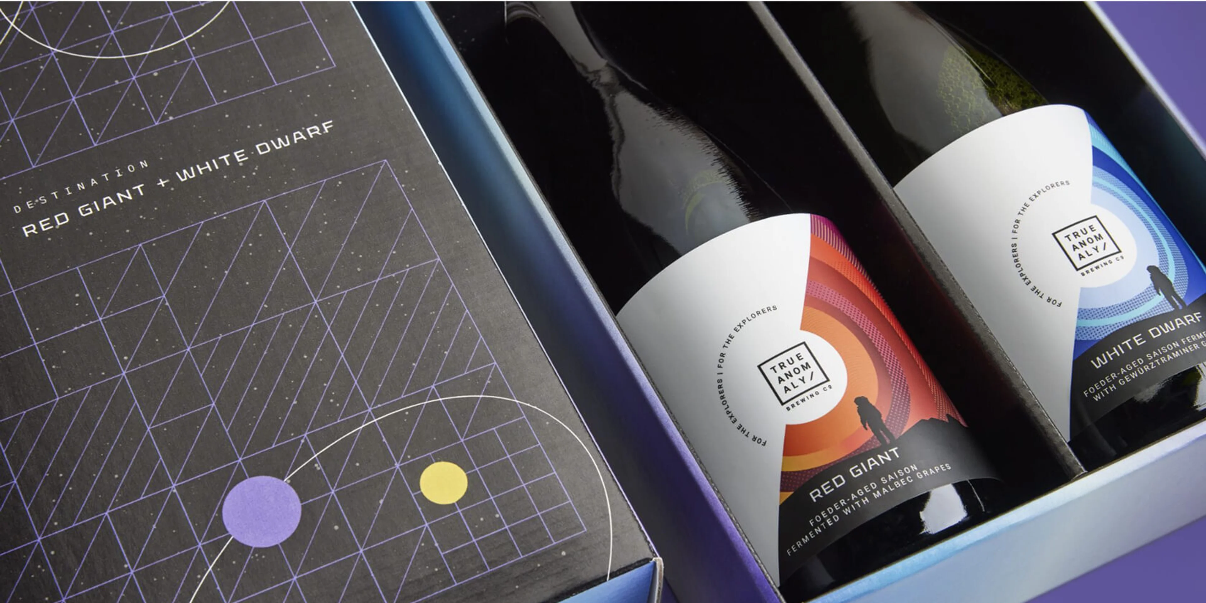
Food & Drink
True Anomaly: How we ripped the fabric of spacetime without spilling our custom-branded beer.

Energy & Technology