Crystaphase
Energy & Technology

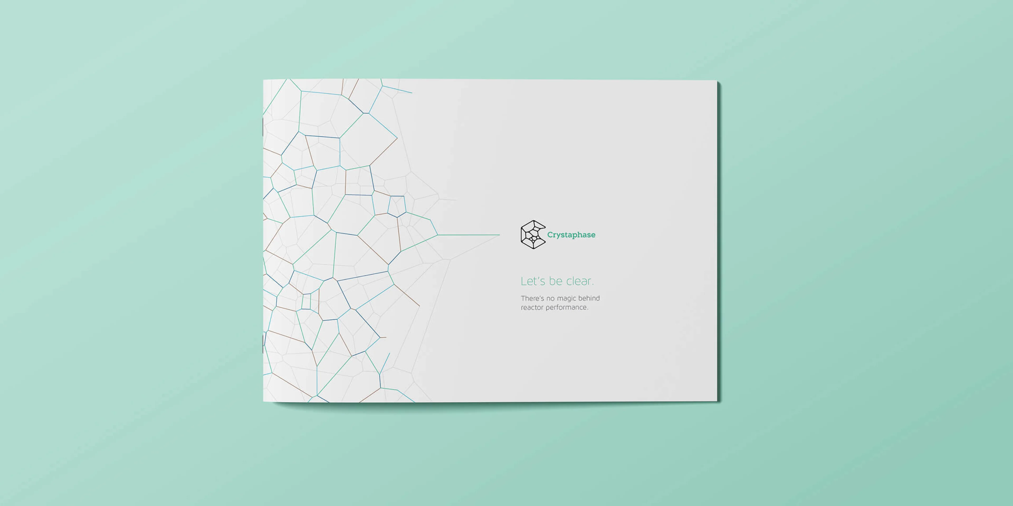
Adding creative catalyst to reactor science without blowing stuff up.
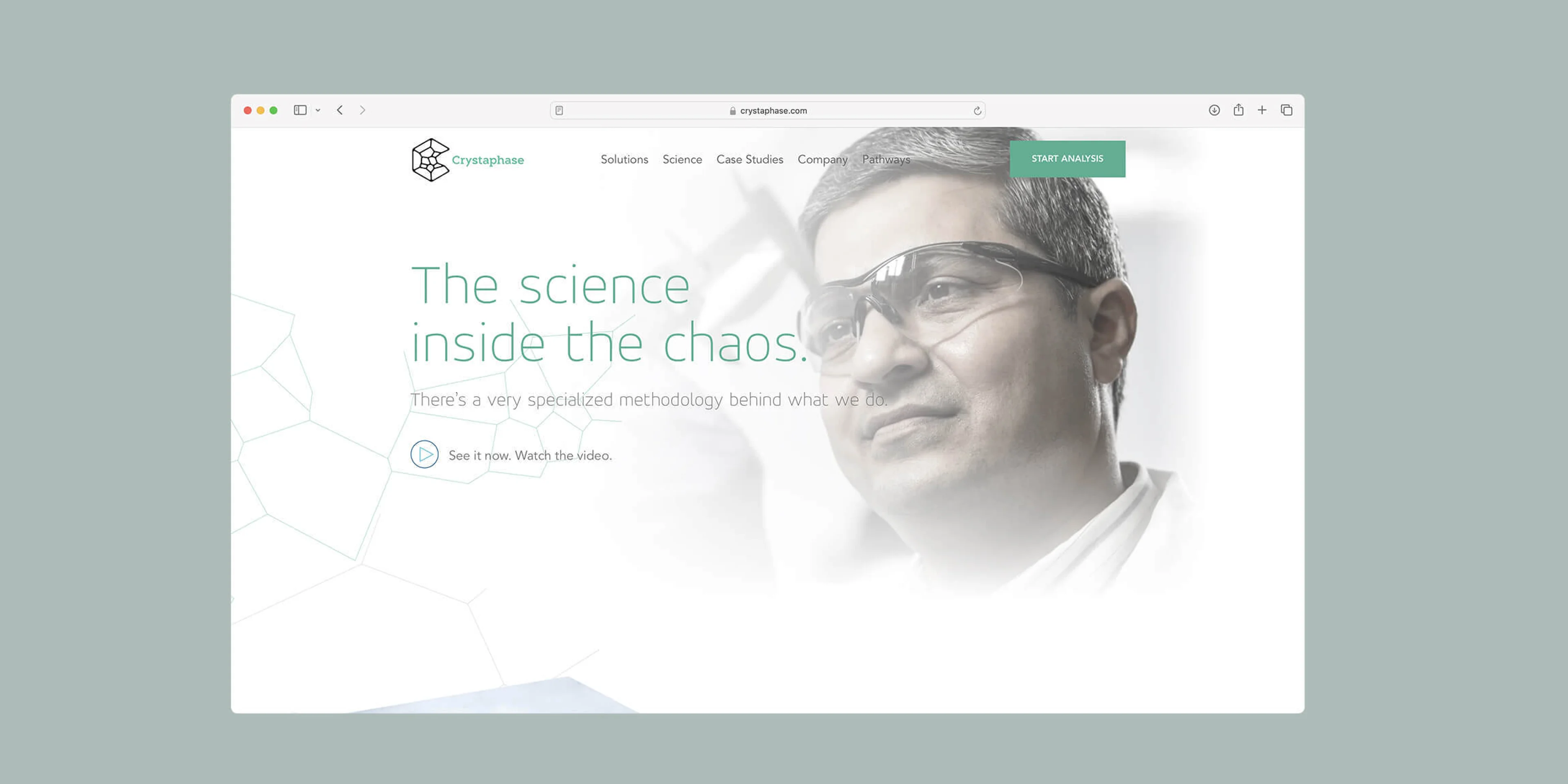
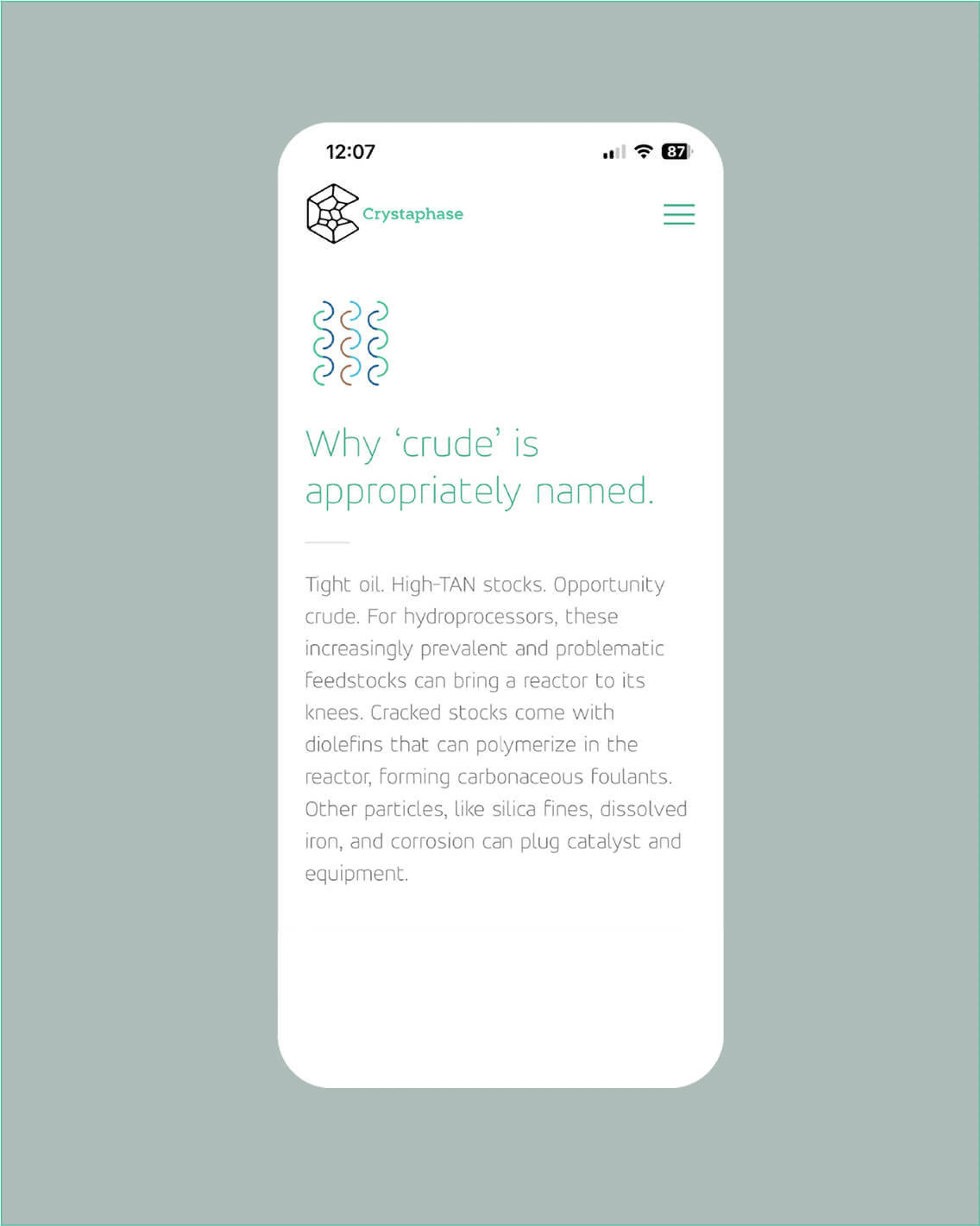
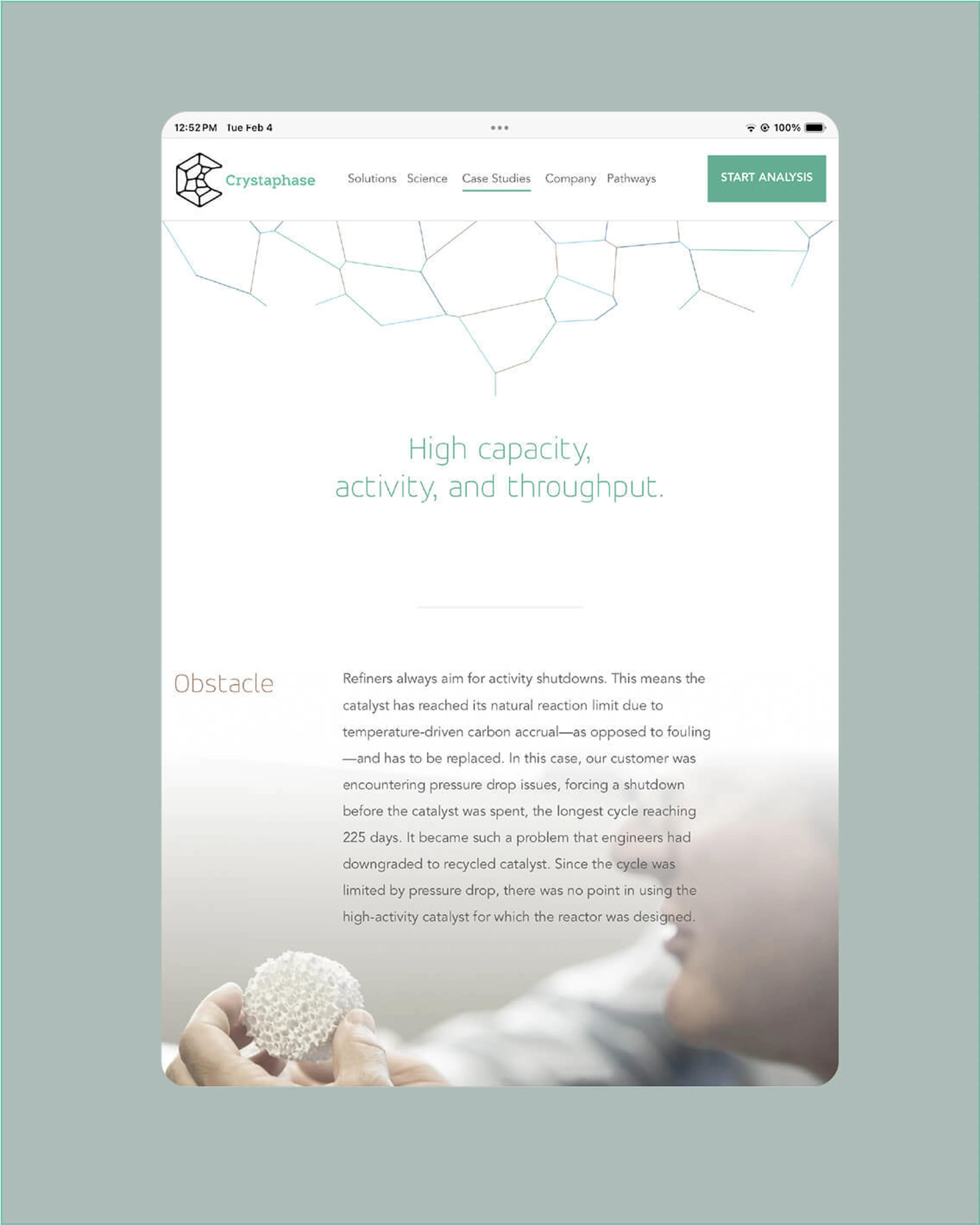
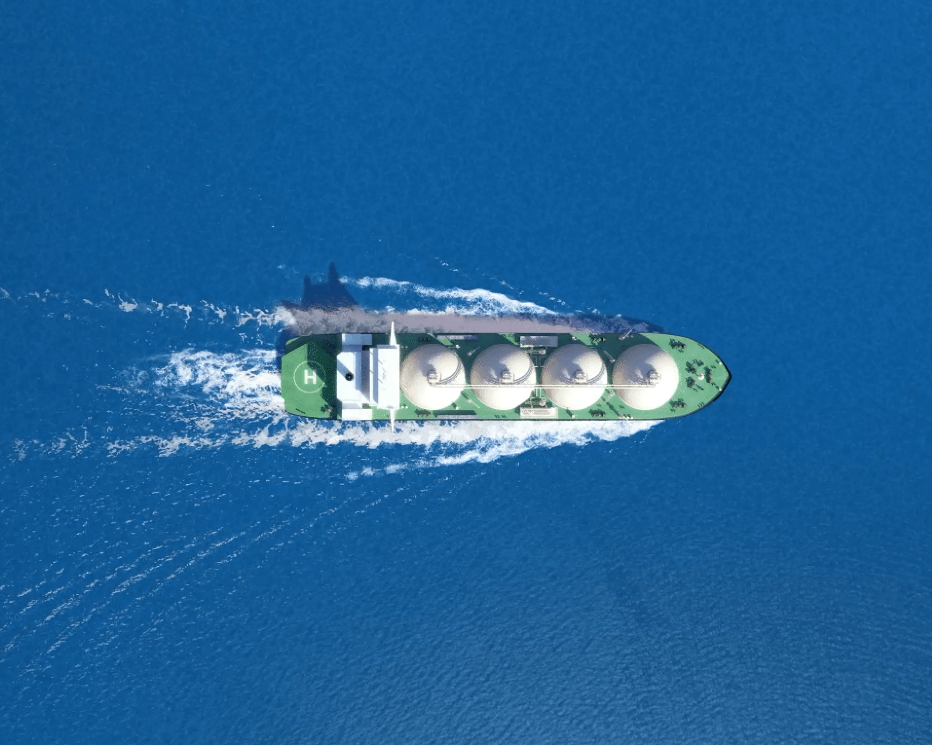
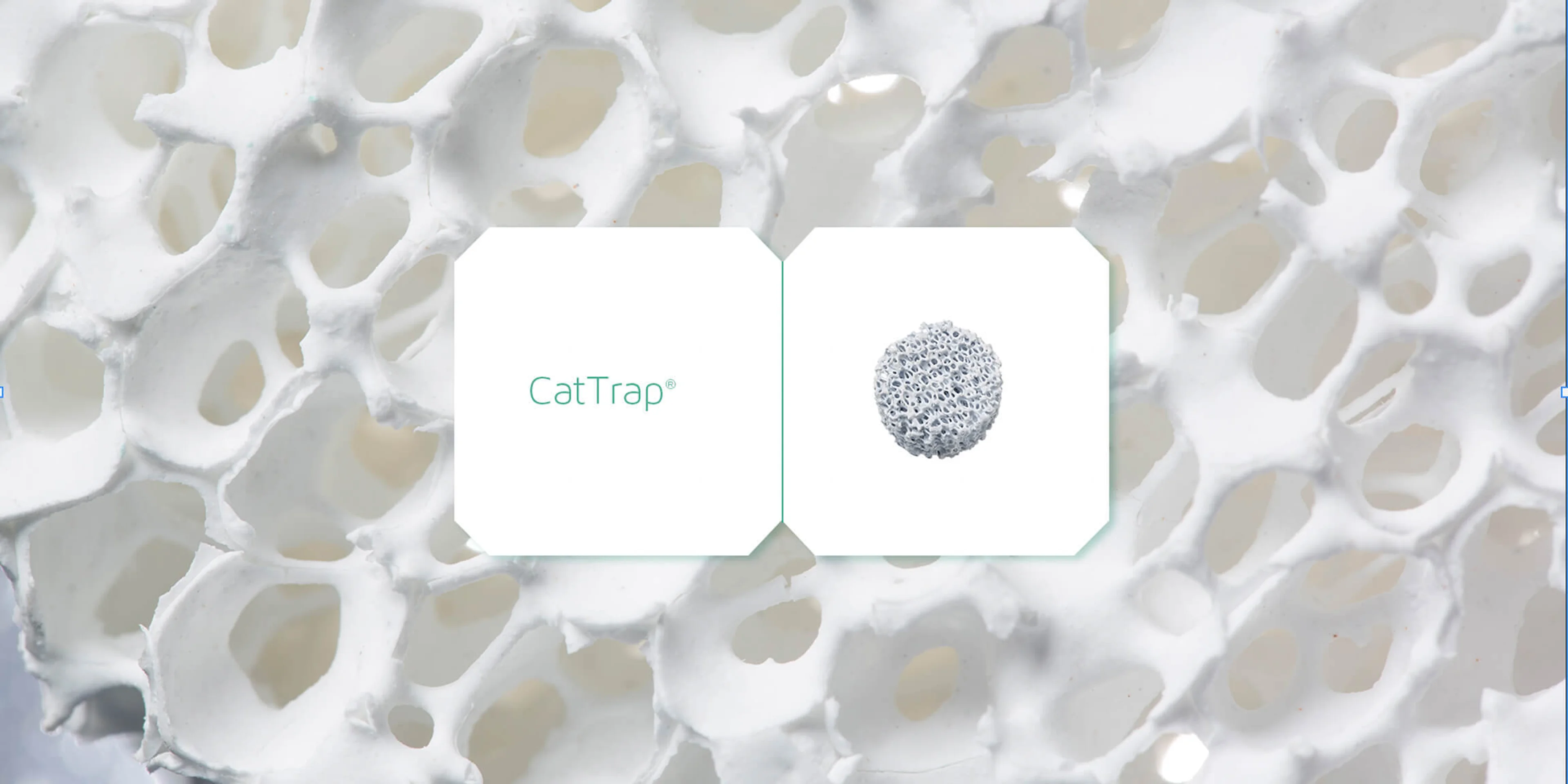
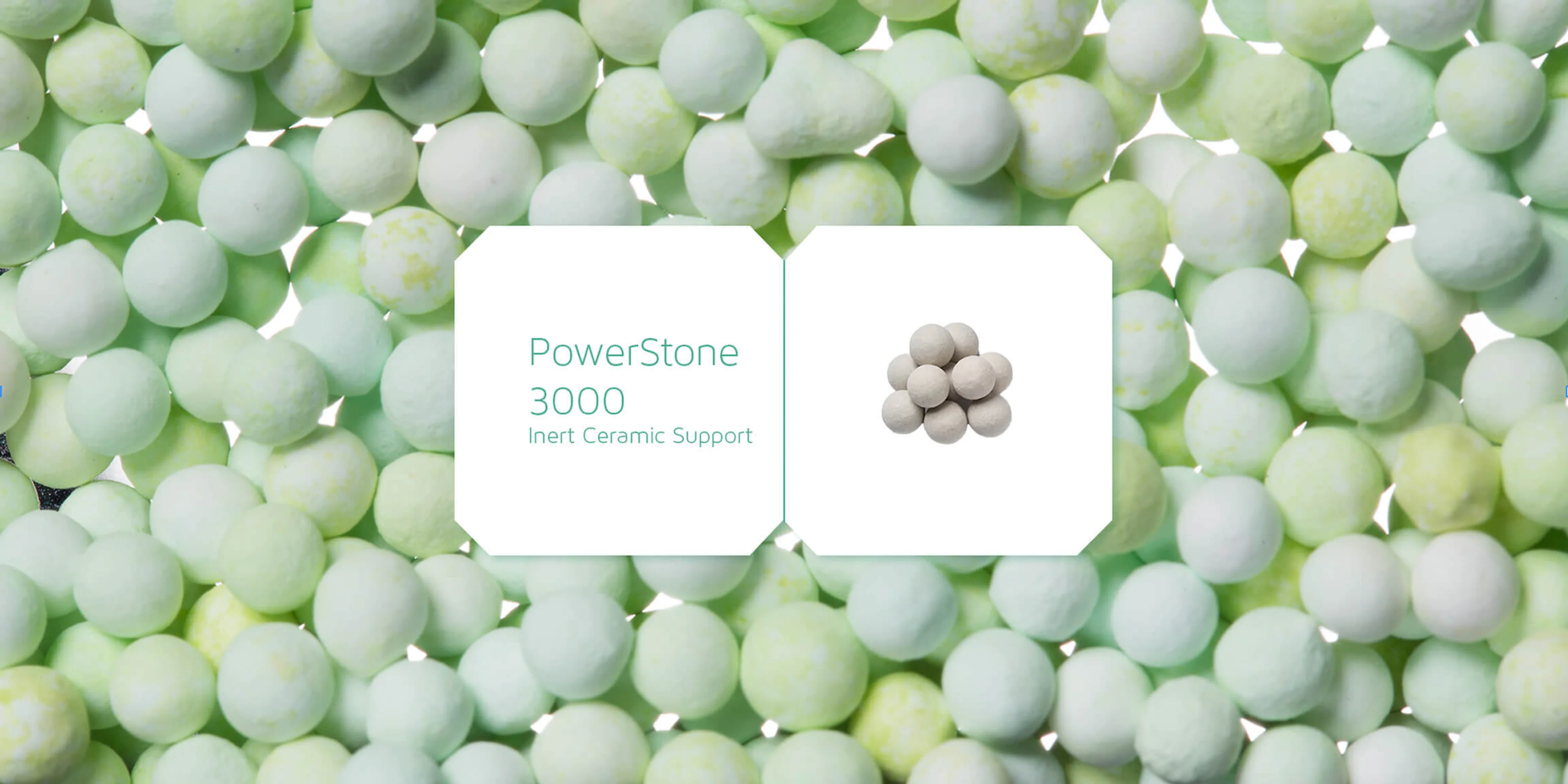
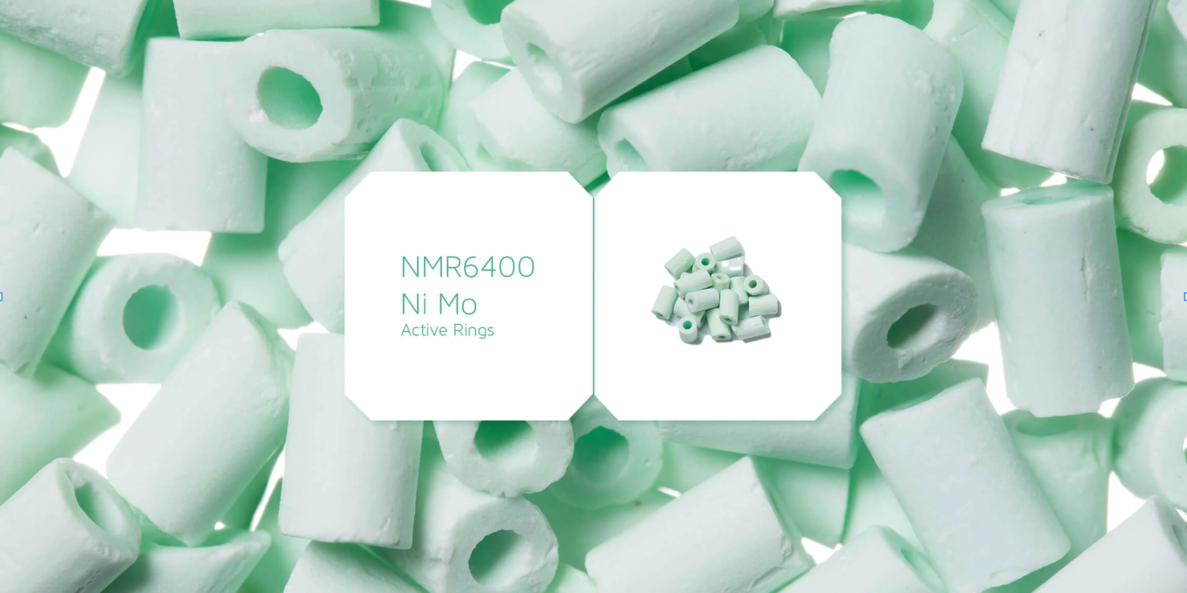
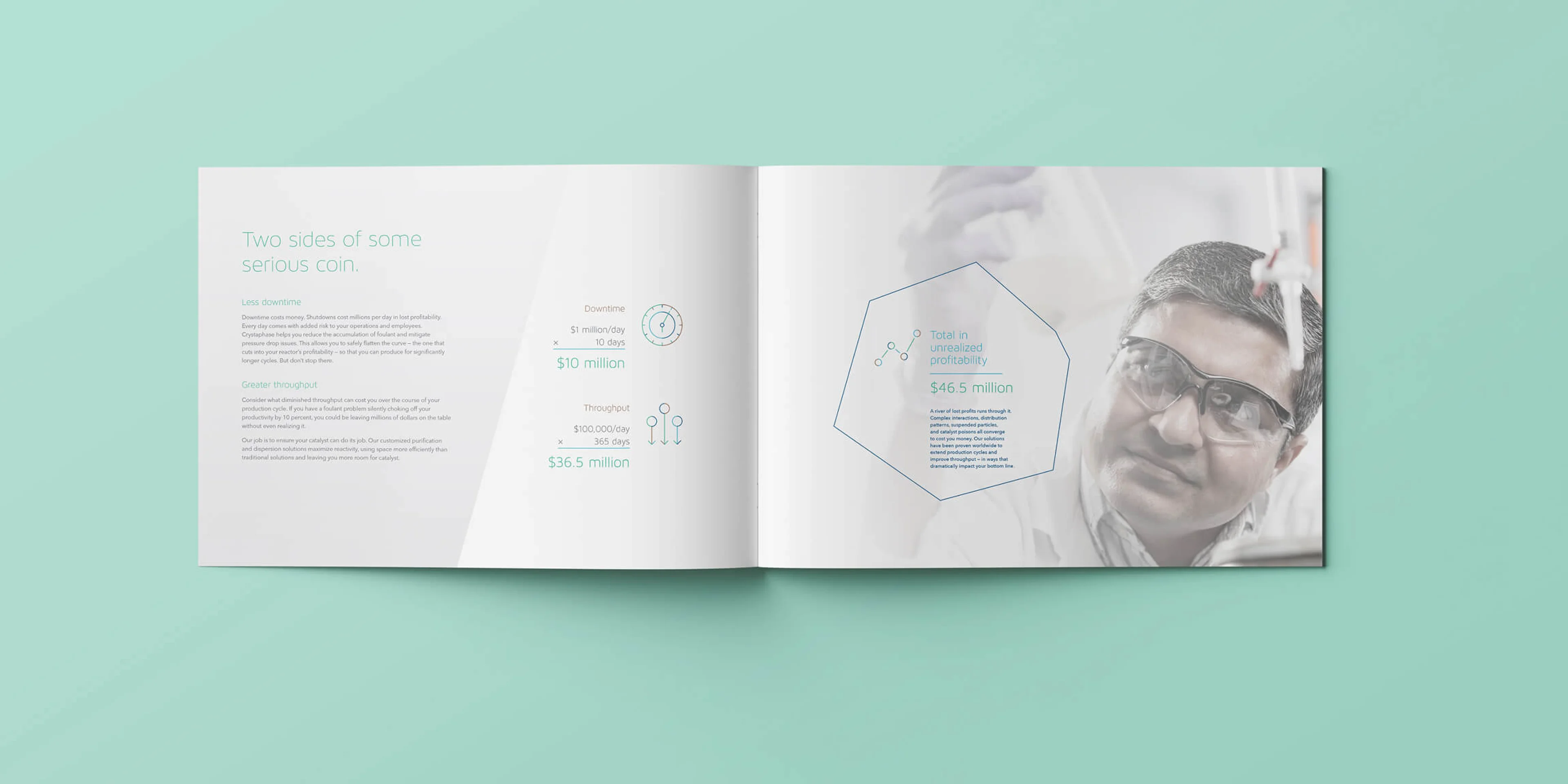
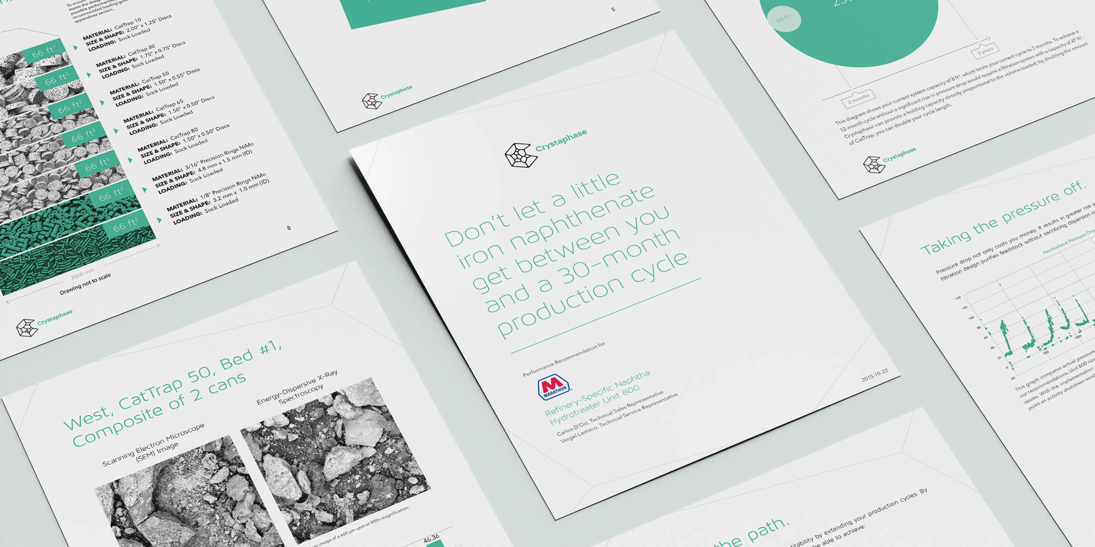
Crystaphase, a supplier of reactor solutions for the hydroprocessing industry, had a big problem—their customers knew their products but not their name. They needed a brand story that aligned with their expertise, not just their product catalog. So, they turned to us for help.What happens inside a reactor is complex—it’s called catalyst optimization. For 25 years, Crystaphase has mastered this science, helping refineries and chemical plants achieve incredible performance. But their messaging was just as complicated as their work. It was time to simplify.
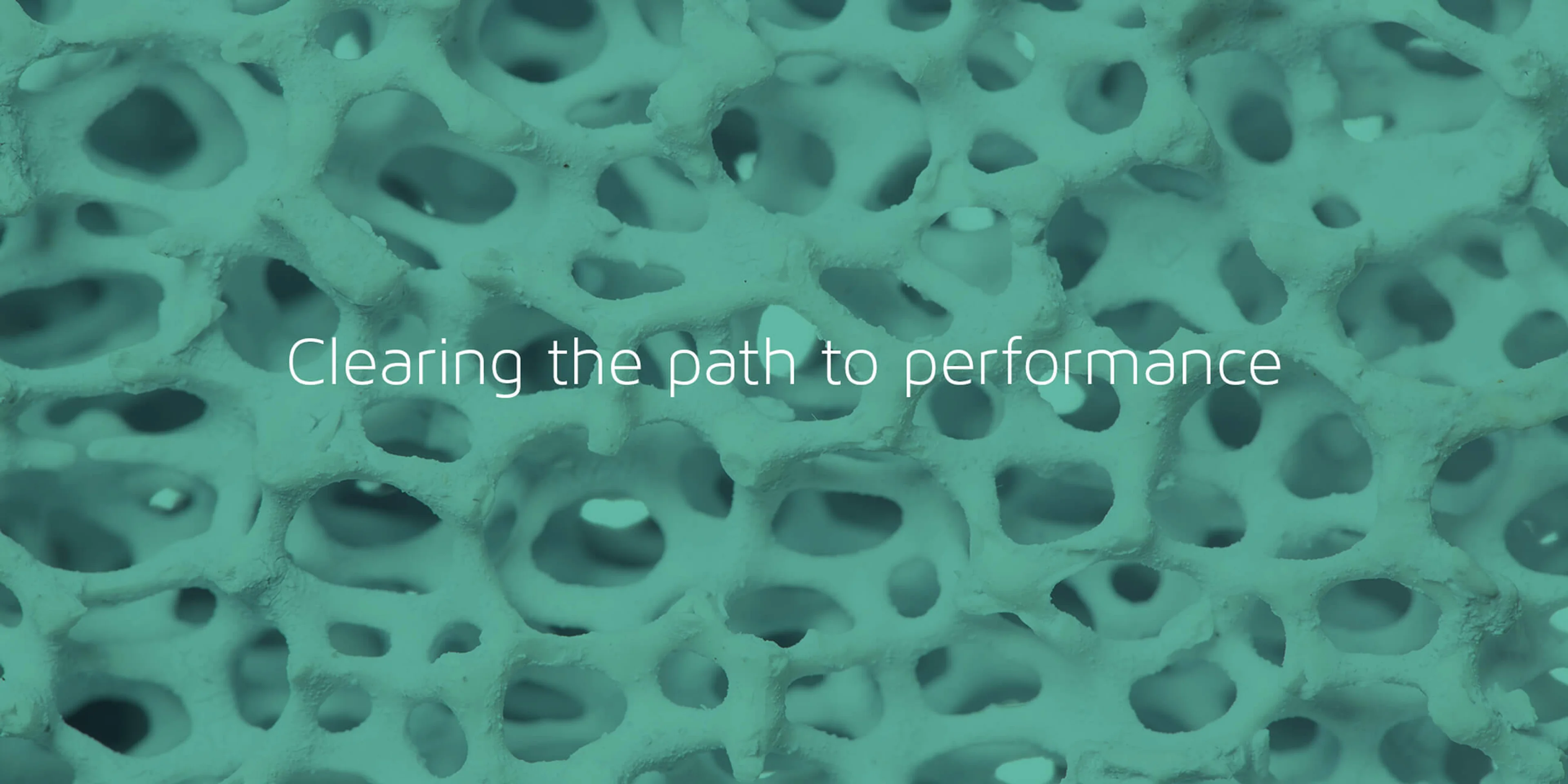
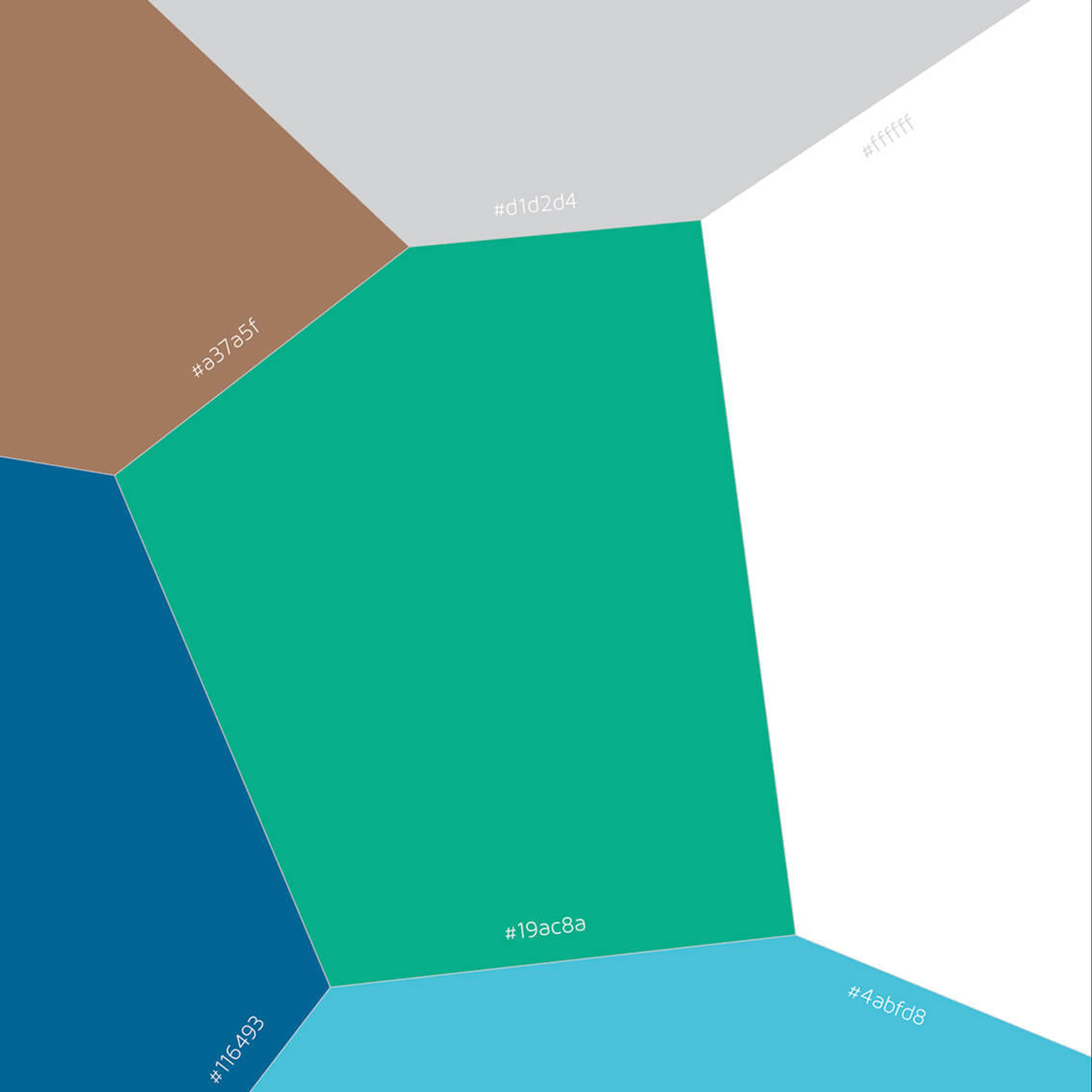
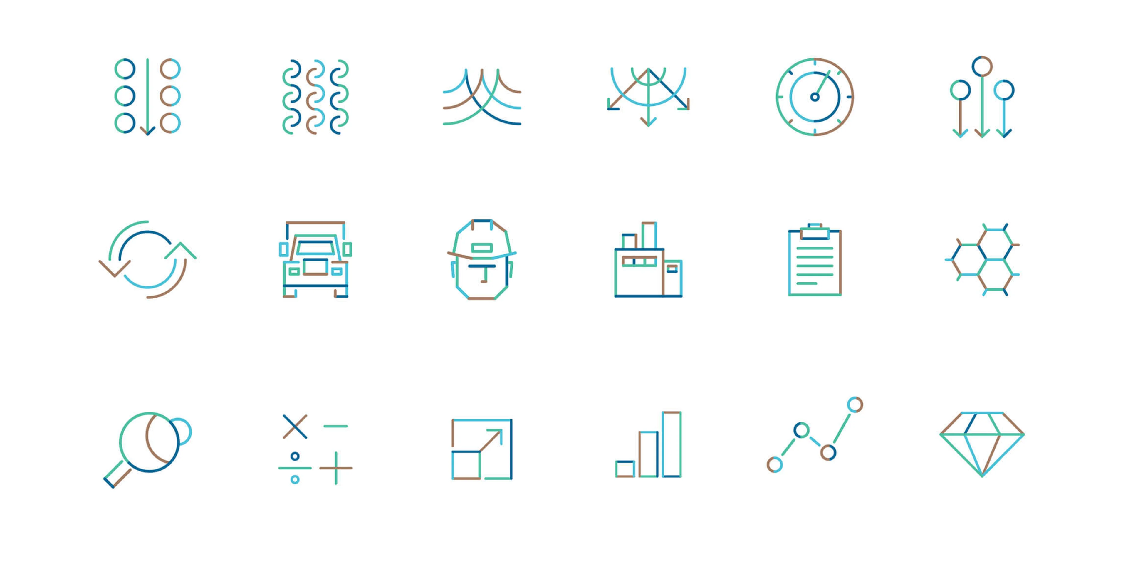
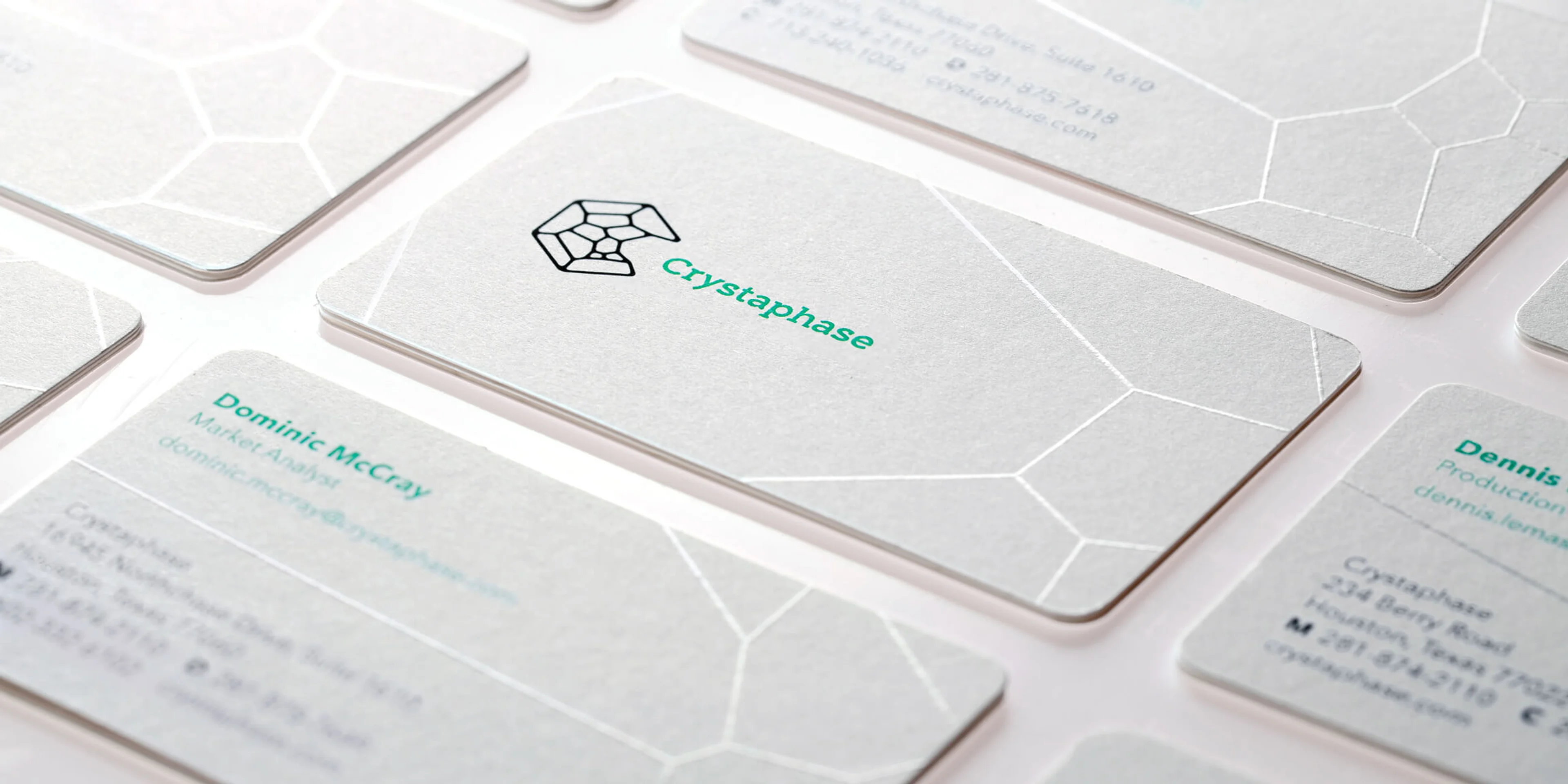
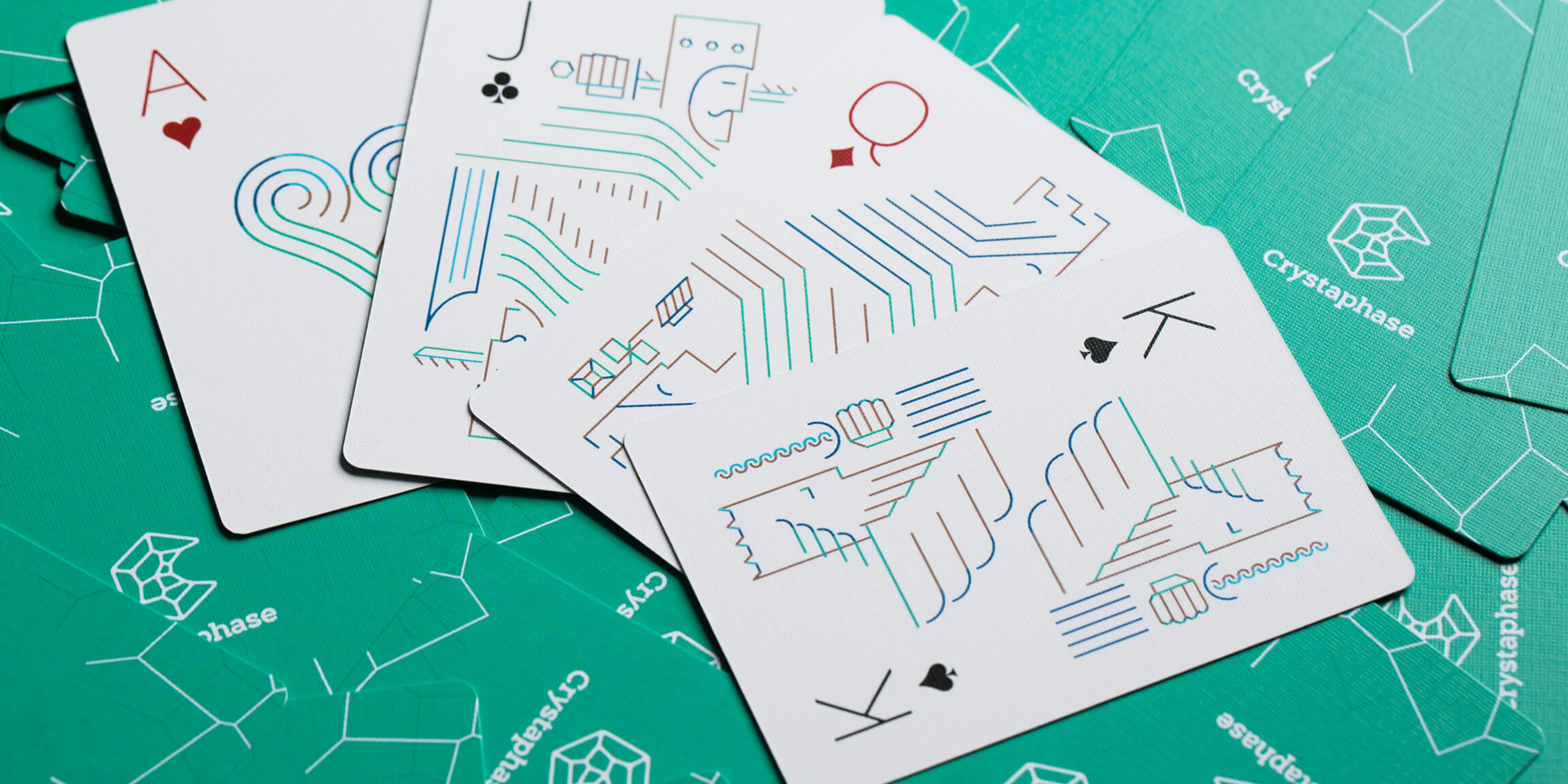
Using our Strategic Guardrails® process, we built a clear, compelling story centered on one key idea: performance. We created a brand identity that made the science approachable, reinforcing that there’s math behind the magic and structure behind the chaos. A bold new logo, website, and collateral brought it all to life.
Services
- Brand Strategy
- Visual and Verbal Identity
- Brand Launch and Engagement
- Digital Experience
- Messaging and Marketing
Brand


Application

Website