Nine Energy Service
Oil & Gas

On a scale of one to ten, we made a perfect difference.
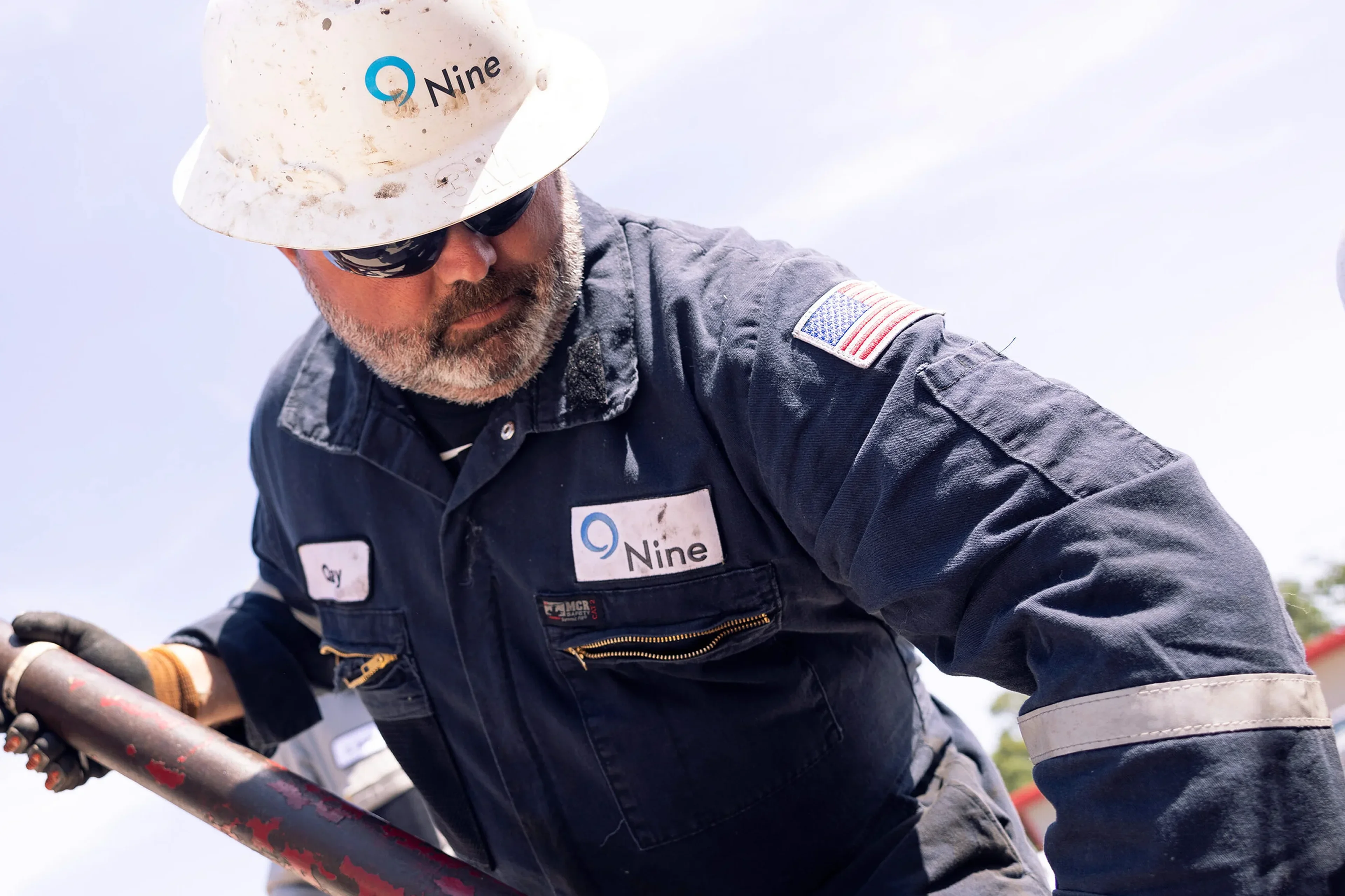
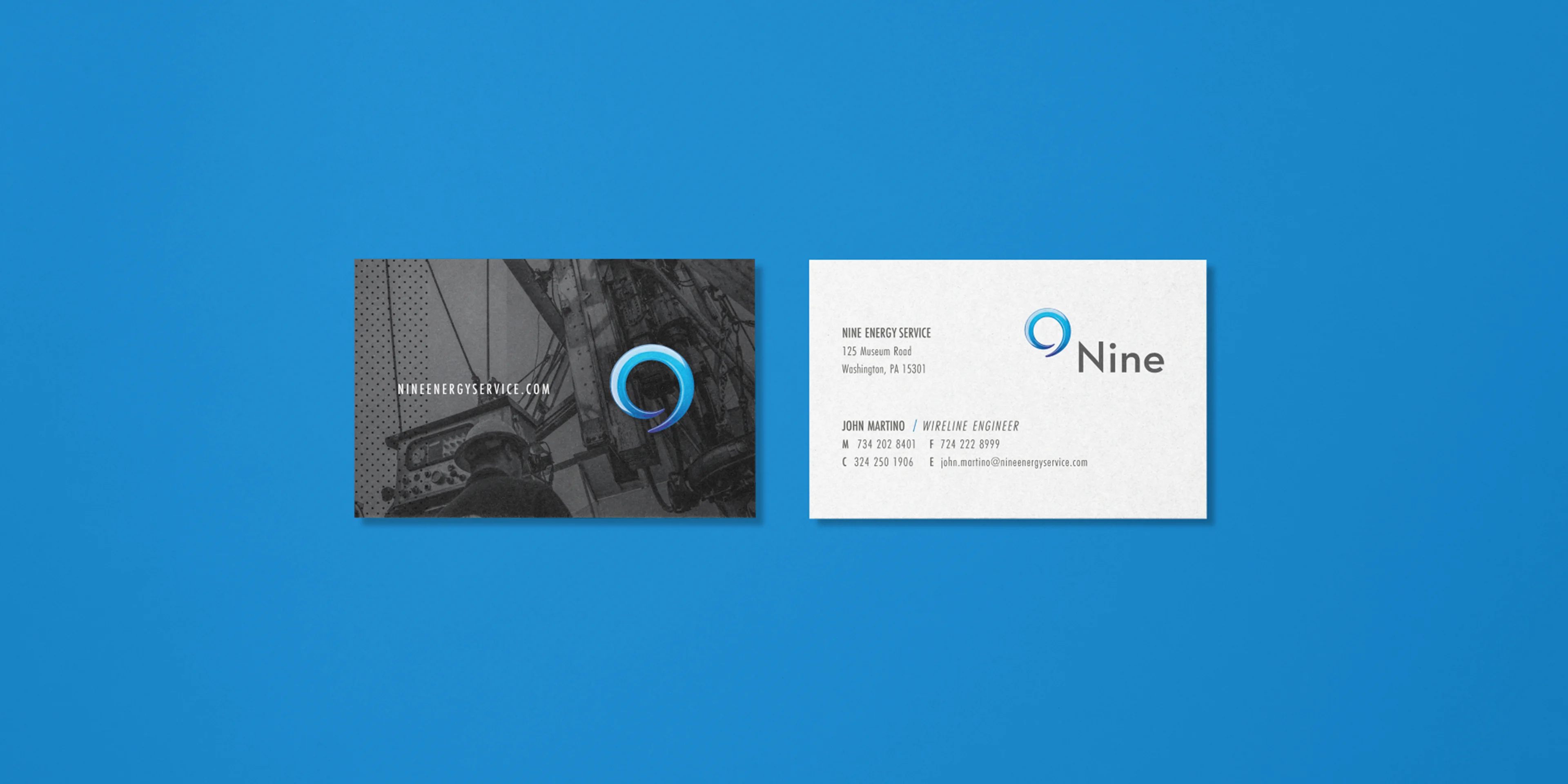
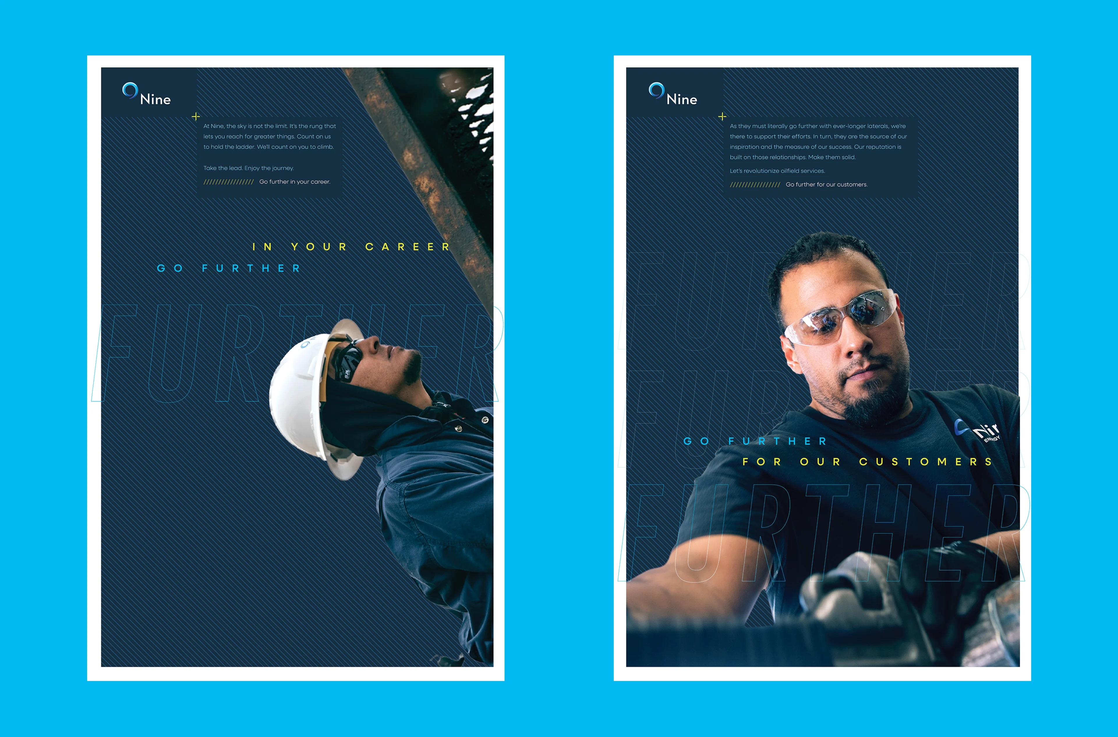
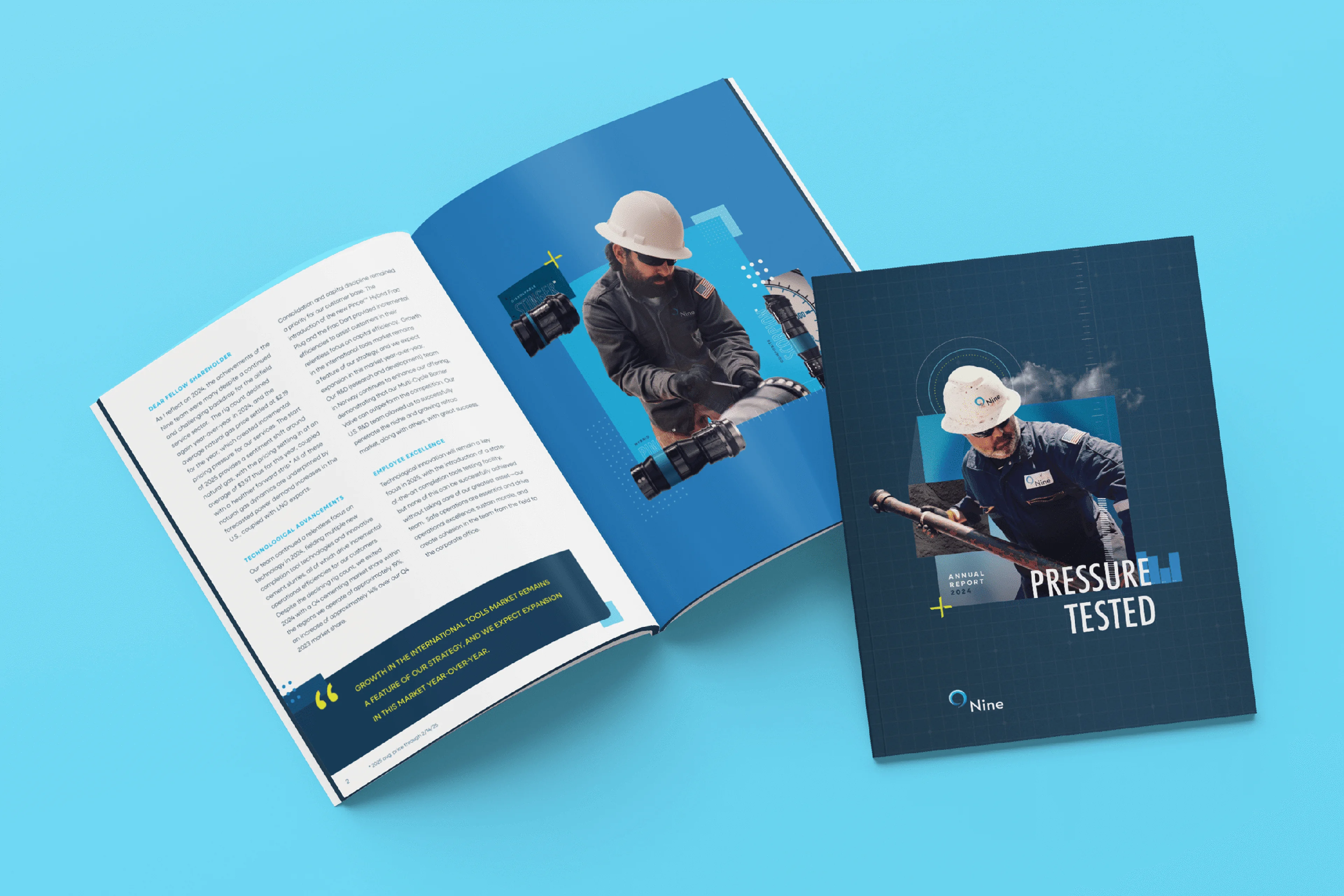
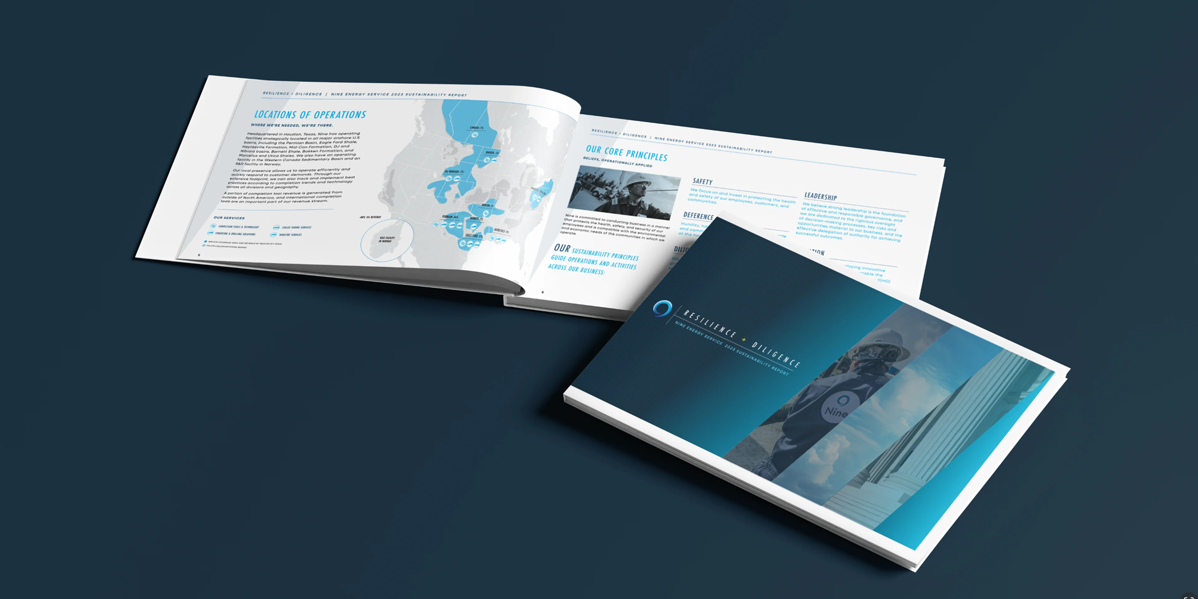
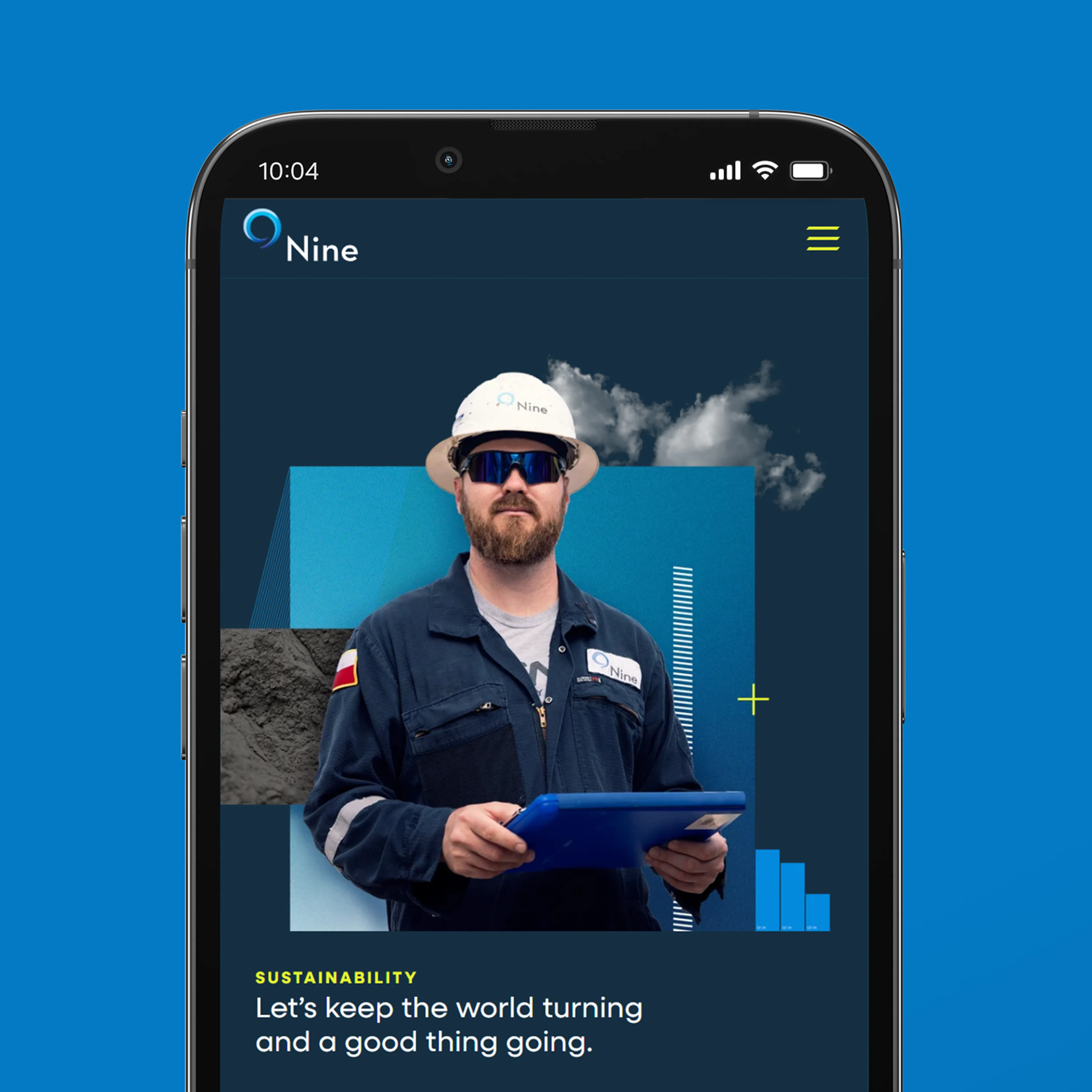
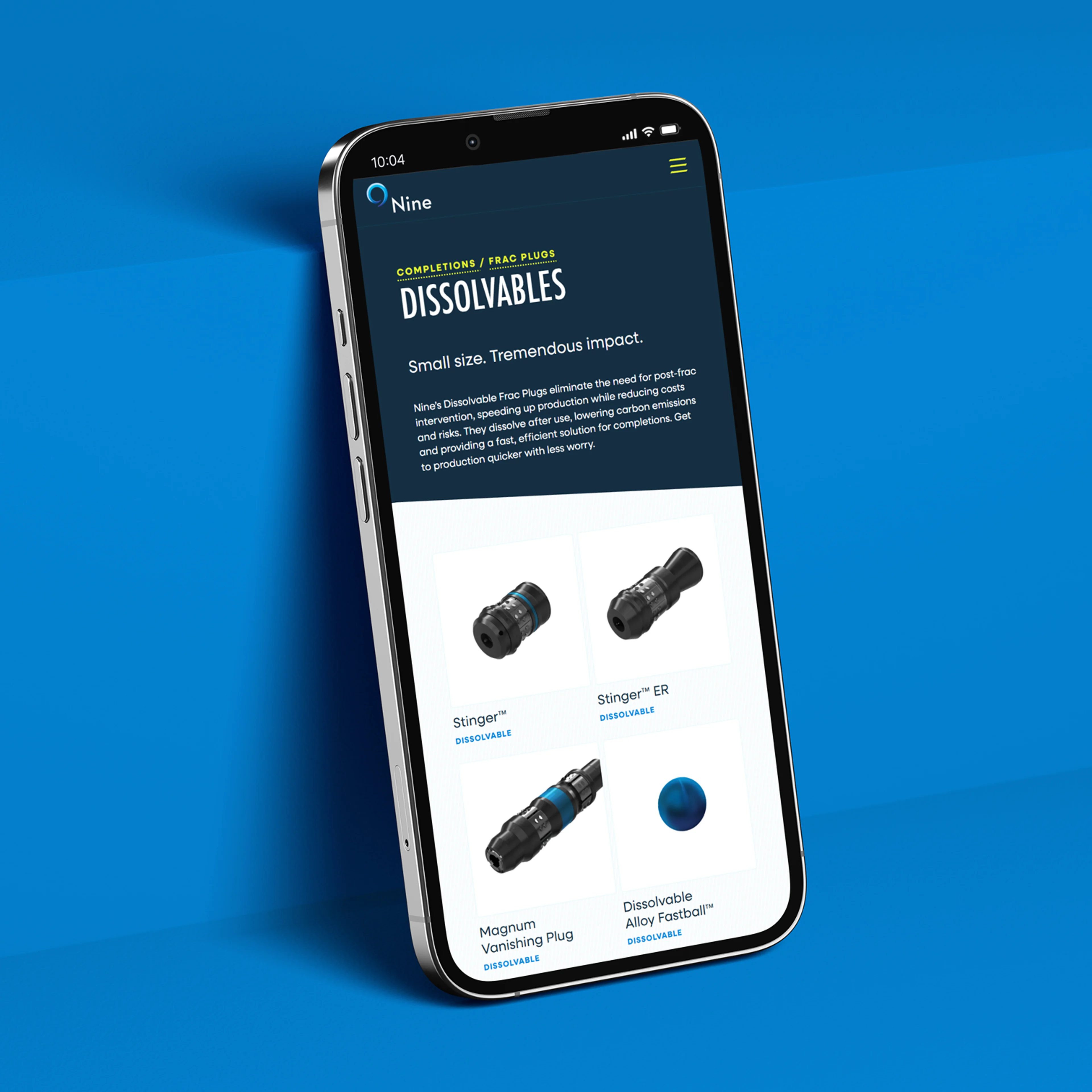
Nine started as a scrappy energy services company, combining the resources of major players with the agility of independents. But as they evolved from service provider to product innovator, their brand needed to match that evolution. Collaborating with the Nine team, we refined their position and visual identity to highlight their focus on precision engineering, advanced technology, and strategies that enhance well production and efficiency. We created a dynamic visual identity with crisp, mechanical brand elements along with bold, kinetic typography. The introduction of a vibrant color palette, updated photography, and a collection of engineering-inspired textures captures Nine’s tech-forward, innovative spirit.
Services
- Brand Strategy
- Visual and Verbal Identity
- Brand Launch and Engagement
- Digital Experience
- Messaging and Marketing
Brand


Application
Website
Heather Schmidt
Senior Vice President of Strategic Development & Investor Relations, Nine
“Pennebaker is able to come up with things that are so outside the box while still being applicable to our company.”