Nutritional product needed a new energy and new audience
"The bottle is our billboard,"
When we first met with Mark Jarvis to discuss a packaging project for his nutritional product line. We huddled around samples of the current bottles that he’d brought in to show us.
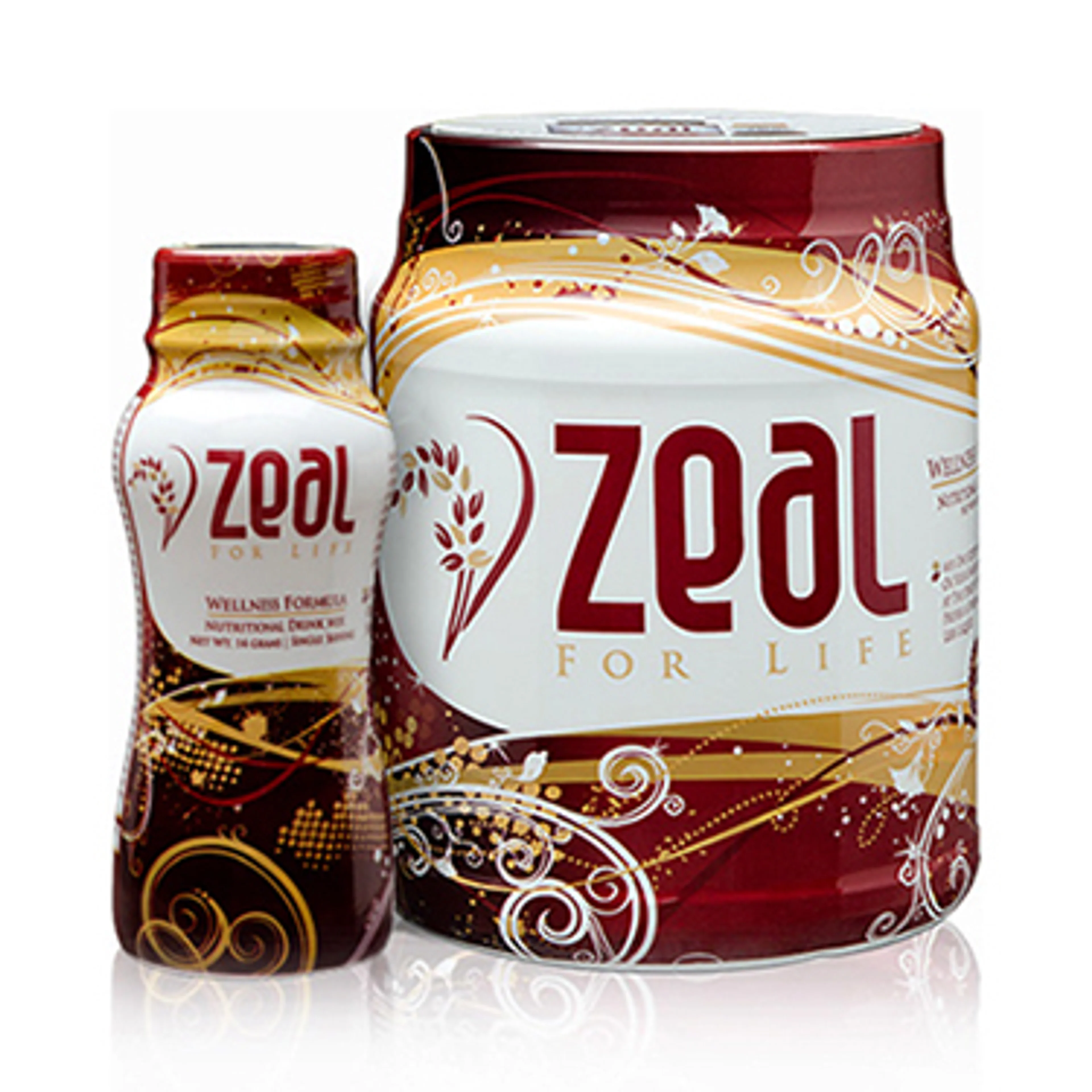
The incumbent
Bouncy swirls of brown and beige danced across the containers. Centered text read simply, “Zeal for life.” If we had to imagine the flavor of the supplement inside, we’d have to say oatmeal. It didn’t seem like a package destined to grab your attention or your taste buds in a grocery aisle.
And yet, we learned, Zeal had been wildly successful.
The line of nutritional products had been selling like hotcakes since Mark and his co-founder and wife, Tracy, introduced them to the market in 2008. Between 2011 and 2014 alone, the company’s revenue ballooned from $3 million to $69 million.
So. In the face of such success, why change? Because Zeal management saw even greater potential for growth if they could just tap into a broader, younger audience. And that, they realized, called for a complete redesign of their packaging. They were looking for something a little more contemporary and a lot more disruptive. They were speaking our language.
The warmup
As with most rebranding projects, we assigned three designers to the task. This approach guarantees a variety of ideas, but also adds a fun, sporting element to the process. Designers are secretly a competitive bunch.
During our strategy meeting, we reviewed the brief. Rather than creating a single design, our goal was to develop a cohesive set of three bottles, each representing one of the three flavors of Zeal. We used keywords like energetic, natural and optimistic to describe the personality we were going for.
How do you portray energetic, we pondered? Maybe with bright colors, irregular shapes suggesting movement, or shapes bursting and rising up. What about natural? For Zeal “natural” means “made with fruit,” so the design might benefit from featuring the ingredients. And optimistic? Optimism requires some blank space, an uncluttered surface, to find its way.
With the parameters clearer and creative juices inspired, the designers were off to do their thing.
The candidates
After three weeks of internal development, meetings, critiques and adjustments, we showed up at Zeal to present four ideas:
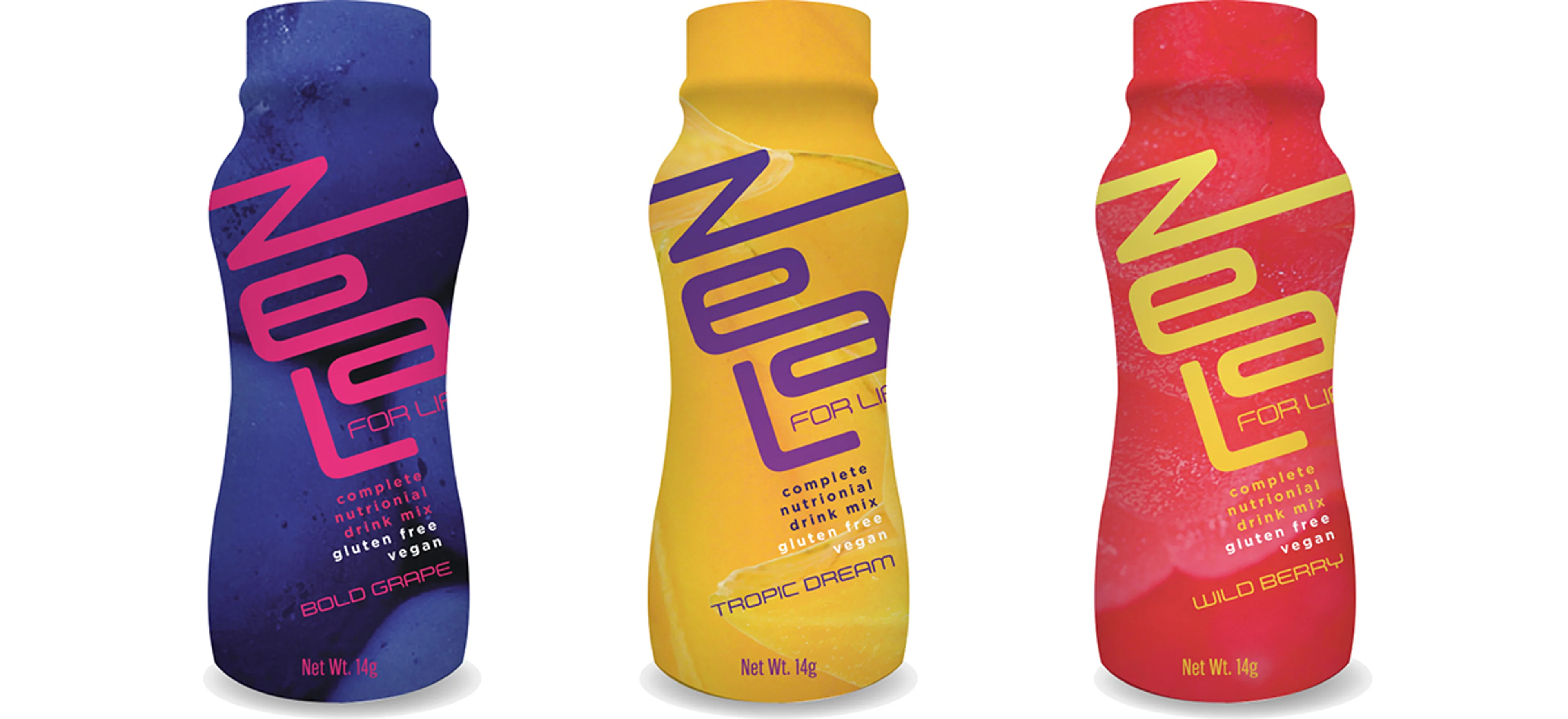
1. The Athlete. In this design, the diagonal treatment of the text infuses energy. Each background is saturated with a closeup of a fruit, making a strong visual distinction between the three flavors, and hinting at the natural ingredients inside.
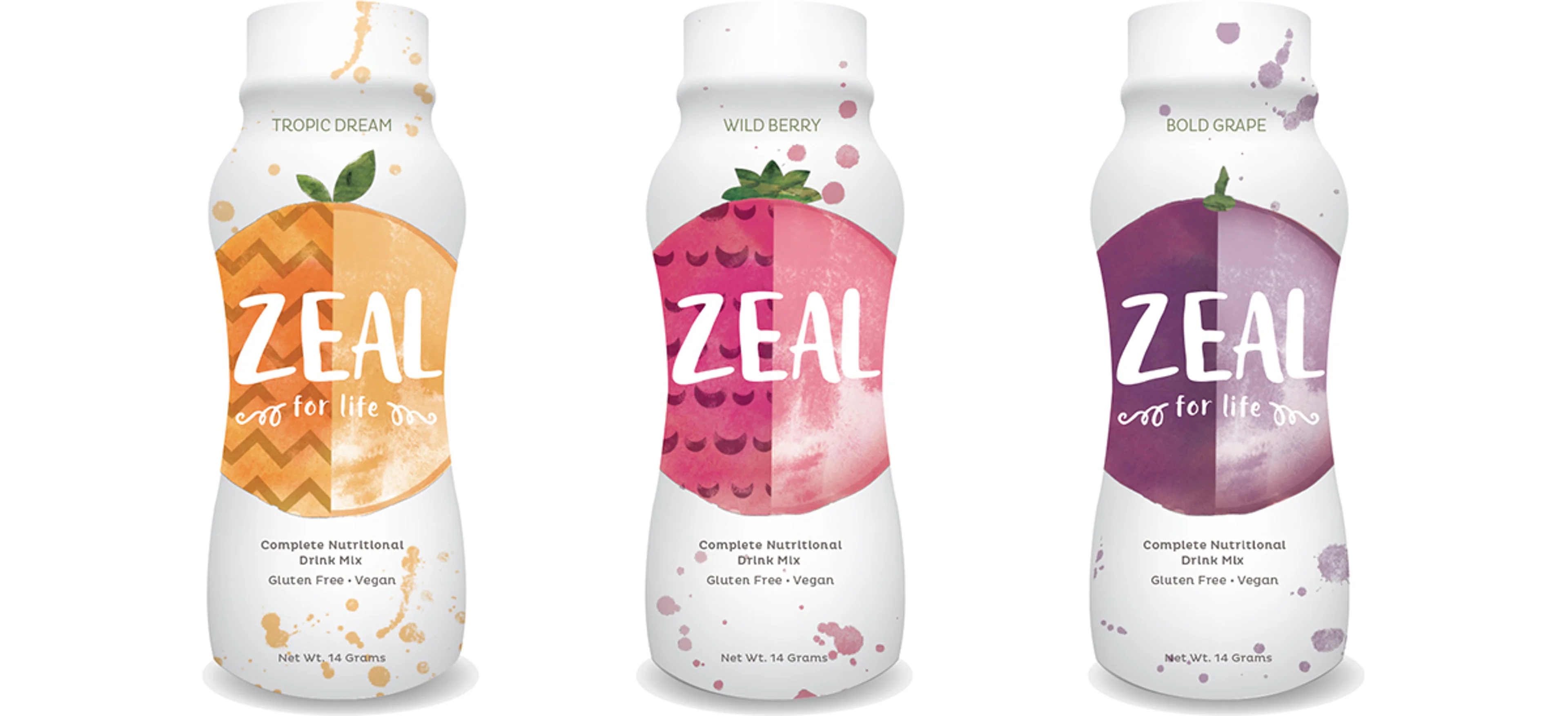
2. The Optimist. Here, a generous use of white space projects optimism. The “burst of flavor” illustration captures the energy of each product, while the colors indicate the type of fruit.
3. The Artist. Splashy watercolor illustrations put a powerful natural spin on this design. Irregular splatters and playful type add fun and energy. A pleasant balance of color and white space project optimism.
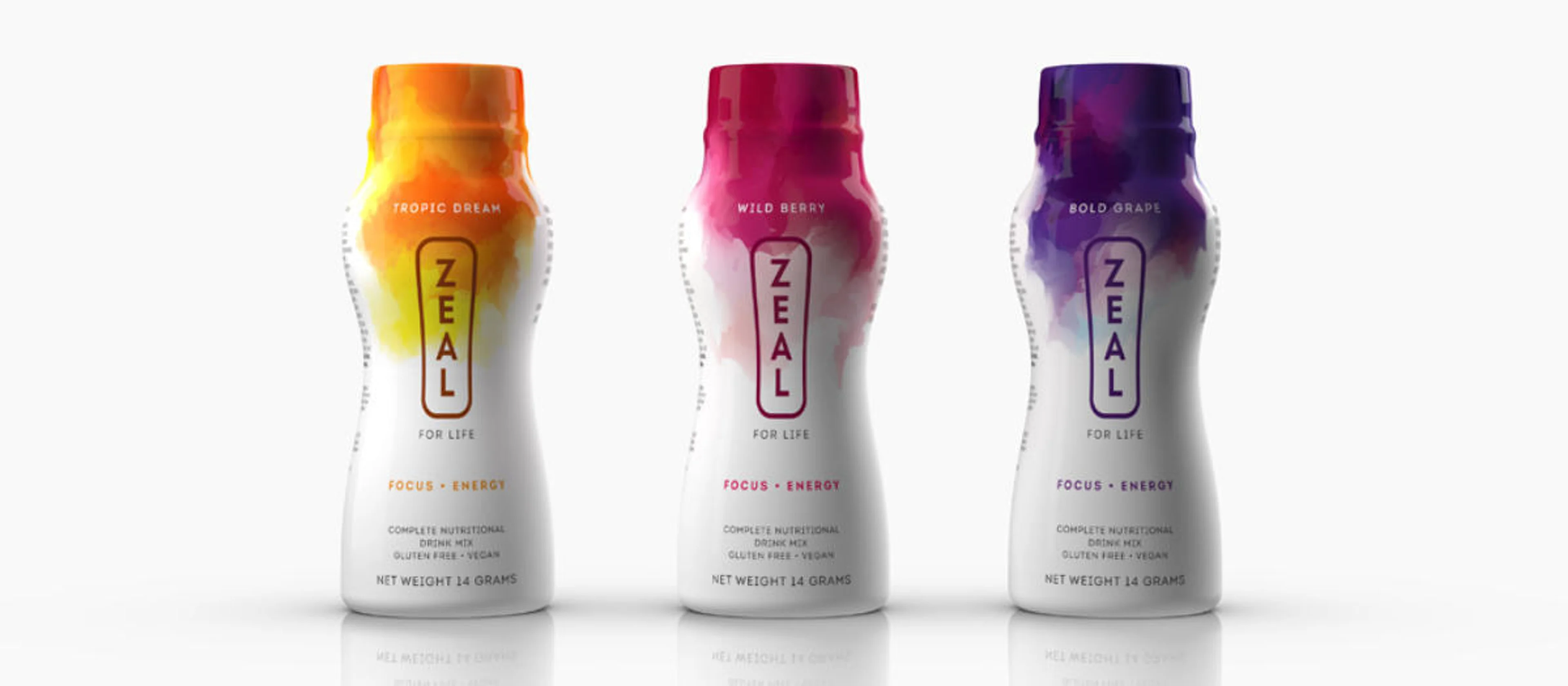
4. The Zen Master. Here, we let colors communicate the flavors, different for each fruit. Playful, colorful shapes add energy and excitement, all balanced by the generous white space. Vertical, Zen-like type hints at the natural quality of the product.
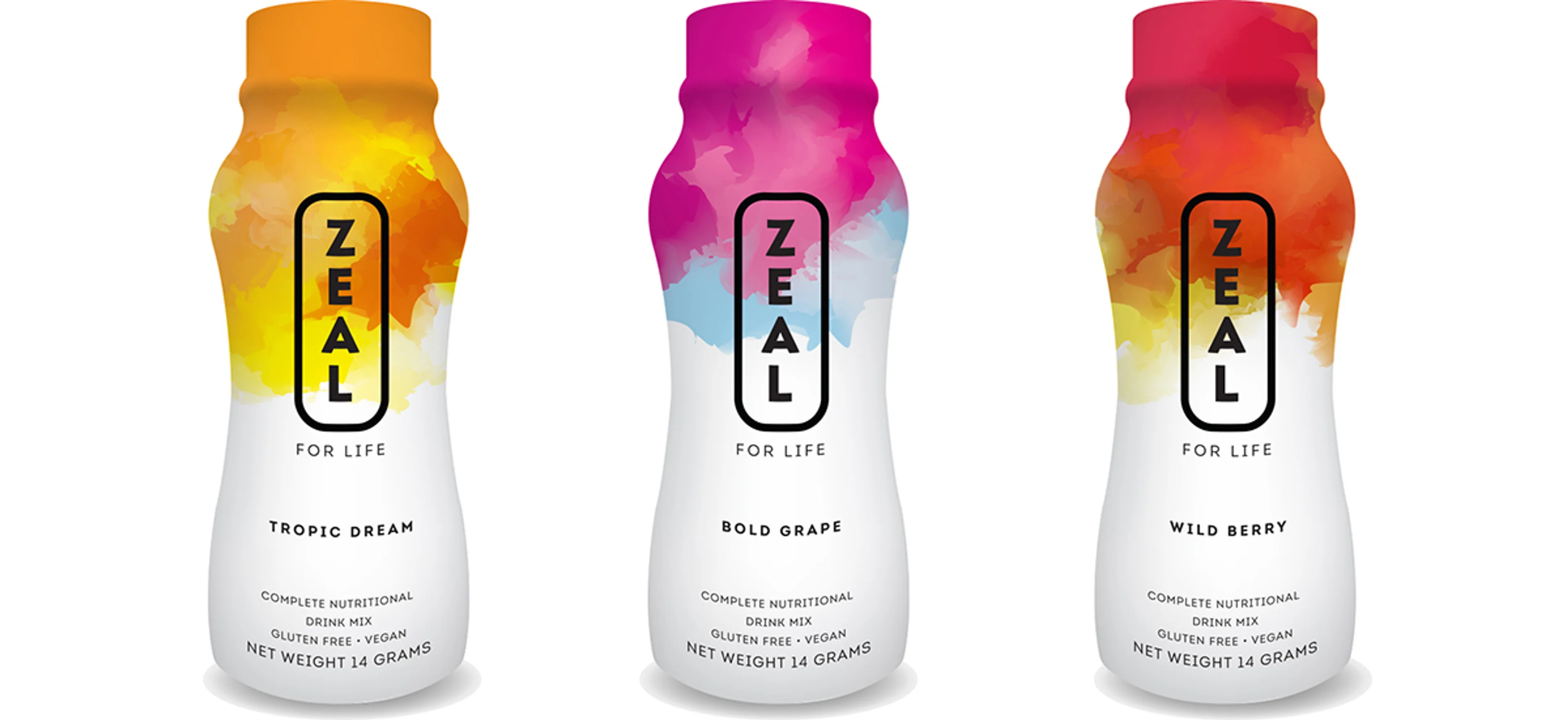
The winner
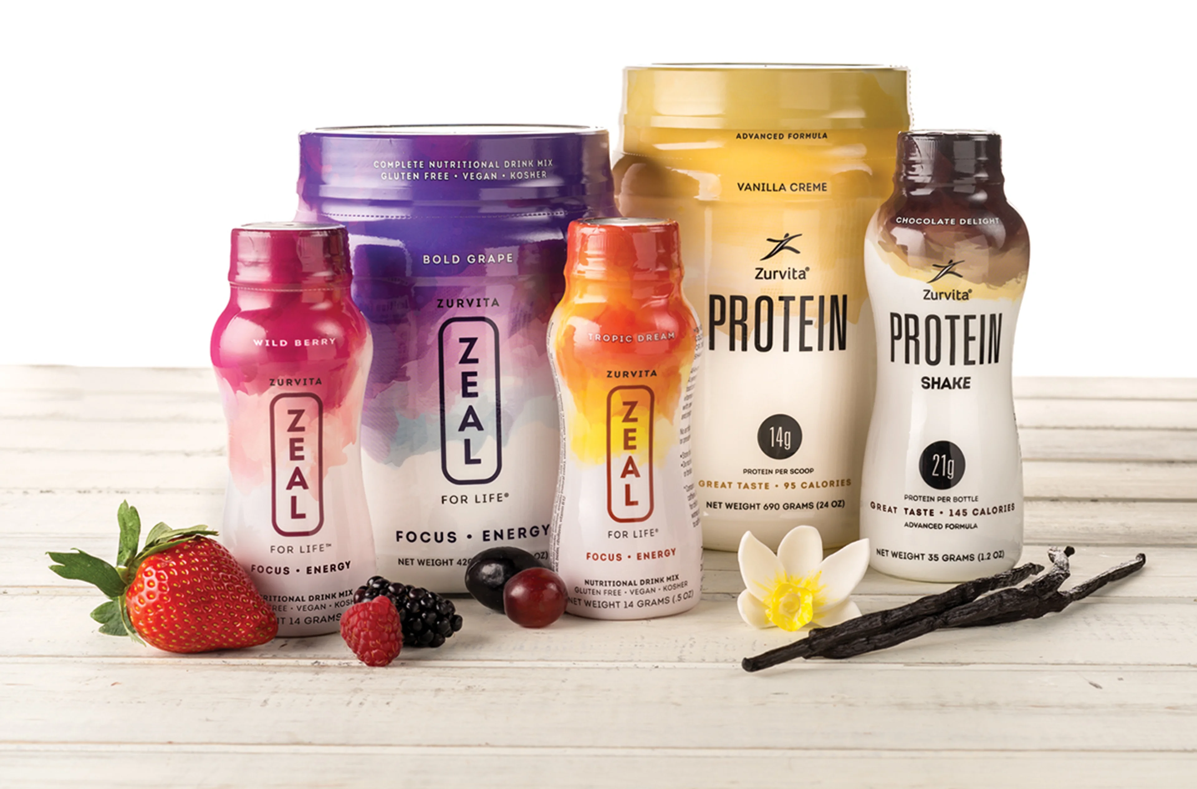
Zeal chose this last design as best matching their vision for the new packaging. Tracy liked the way the design gave a sense of flavor floating into the bottle. With a few minor tweaks, we received final approval and began applying the design to the entire line of products.
The reception
Zeal unveiled the new packaging during a sales conference and, judging by this video, the sales team was pretty excited. (Or maybe those were just the effects of Zeal? In either case, we’ll have what they’re having.) Looks like the doors to that broader, younger audience are now wide open.
Icing on the cake
Last year, Graphis* recognized the new Zeal packaging with a Silver award in a graphic design competition.
* Graphis is an internationally renowned citadel of graphic design excellence.
— The Pennebaker Team