There are as many answers as there are people. More, in fact, considering some can’t make up their minds! We asked our creative team for their opinions. Here’s one of the answers.

Now mind you, I recognize this is way too broad and subjective a topic to address definitely. There will never be one right answer. All I can do is give you my answer. But where to start? I was having a tough time wrapping my Lilliputian mind around this big question. So I did what I often do when I'm feeling frustrated. I went to lunch.
Over a plat of smoked Carolina-style ribs and green apple celery slaw, I posed the question to a ragtag panel of totally unlike-minded designer friends. After an hour of having a loud, Black-barbershop-style debate, we could only manage to agree on two things:
To be fair, you need two categories of logo.
One for big well-known brands and another for small companies and products. Most people can only recall the logos for companies like Apple, Coke, or Starbucks who have spent massive sums of money to ensure that their image, and what it stands for, is permanently burned into your brain. The little guys don't stand a chance against multi-million-dollar media budgets.
You need a set of criteria.
What are the attributes of a great logo? We thought something like the following would suffice:
Concept — Not all great logos have an idea behind them, but the best tend to have simple, basic concepts that transcend time, culture, and technological shifts.
Endurance — Some of the best logos stay that way simply because they began with good bones. By that I mean that they were structurally sound and conceptually and graphically rich enough to adapt to the continuous changes in production technology, style trends and the occasional marketing dictator. The iconic Shell, Prudential, John Deere and Apple logos are prefect examples.
So armed with categories and criteria, here are my picks for the best of all logos since the beginning of time.

Big Company:
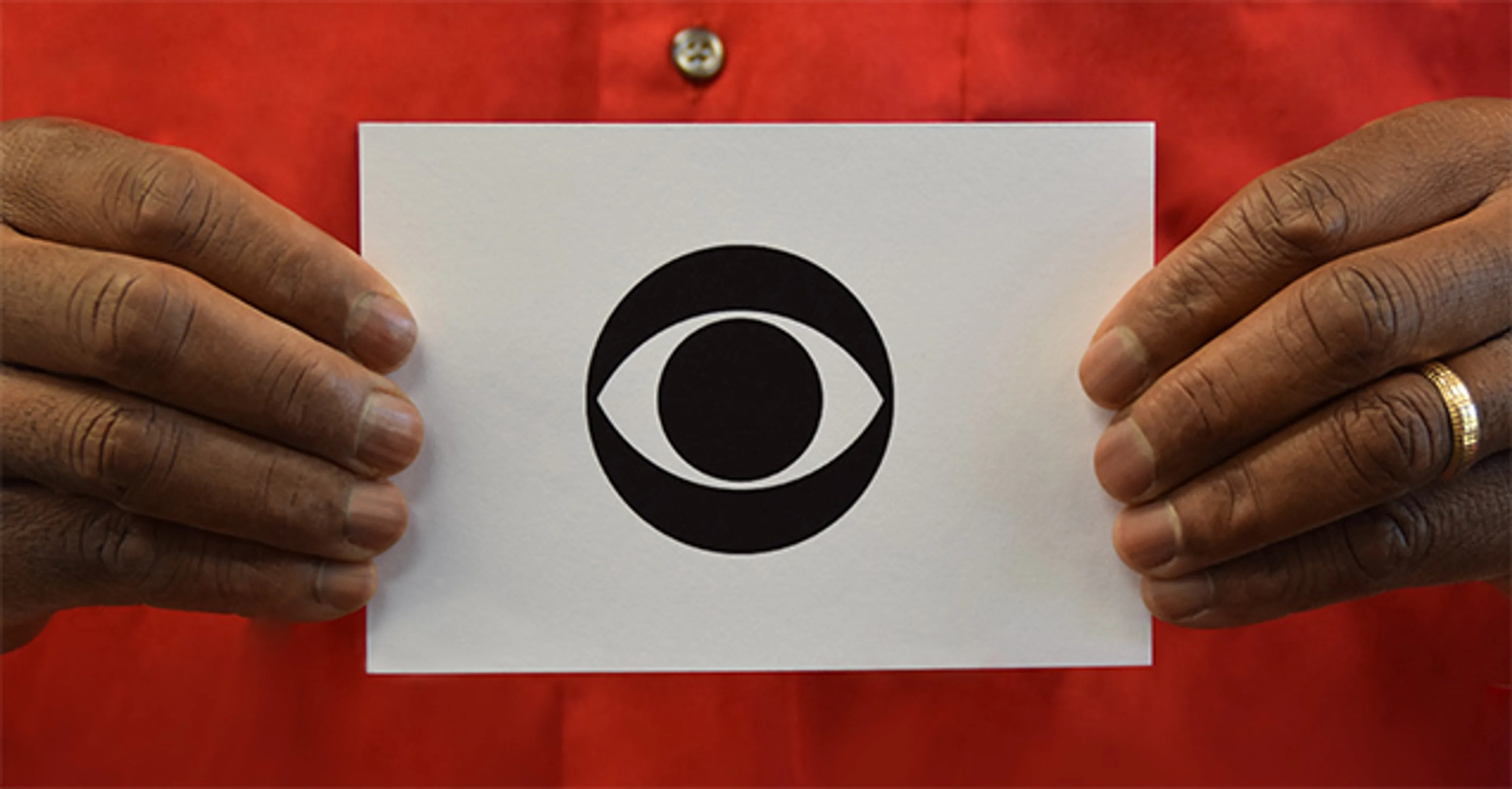
CBS, Designed by William Golden
Most logos that have managed to hang around for 60 plus years have had at least a little logo liposuction done over the years, but this beauty remains virtually untouched. And why shouldn’t it? Its balance and structure were near perfect to begin with. And while CBS applied glows, gradients and other trendy effects though the decades, they have the good sense to leave its bones alone.

Small Company:
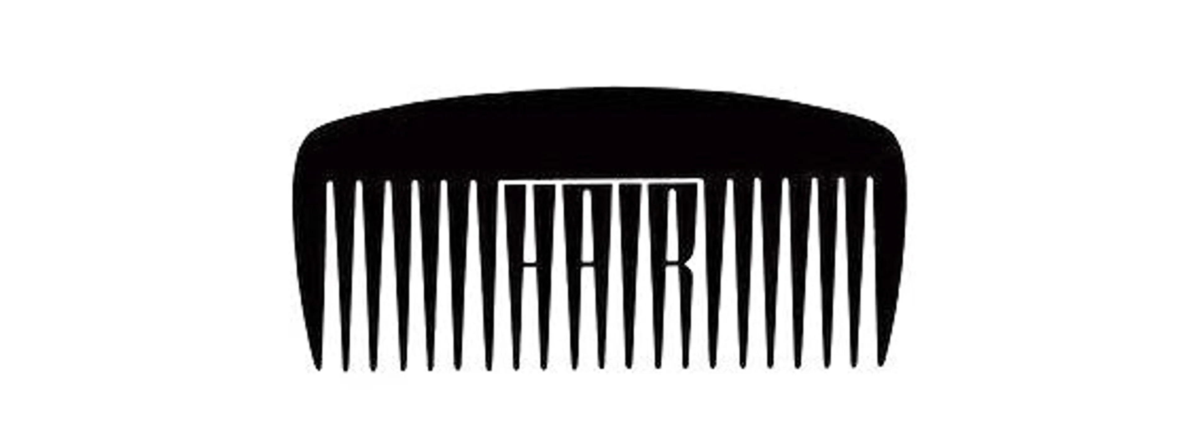
Mr. and Mrs. Aubrey Hair, Designed by Woody Pirtle
It's gorgeously simple and conceptually perfect without being obvious. One thing that keeps me motivated and working is the hope that I might one day create something this beautiful and timeless.
— Jeffrey


