There are as many answers as there are people. More, in fact, considering some can’t make up their minds! We asked our creative team for their opinions. Here’s one of the answers.

To explain my choice, I need to take you back to 1970s Poland, when the textile industry was churning out stores full of uninspiring garment. Proletariat-influenced, box-shaped outfits came in all shades of browns and grays. And while the nation stayed protected from the elements, for many women the iron curtain was no excuse for poor taste. Small tailor shops flourished, frequented by ladies clutching magazine clippings of Sophia Loren and Brigitte Bardot sporting the latest fashion.
My mother was one of these women.
The tailors were glad to recreate the designs, but it was the woman’s job to purchase the fabric. And that was not a small task.
The amount of time a woman can spend in a fabric store is astonishing. If you were a little girl dragged along for the trip, you were doomed. We’d go from one fabric store to another, my mom touching, pinching, stretching materials of every color, weight and pattern, then frowning, squinting, and not willing to miss a single fabric roll — in the hope of finding the perfect one. For a child, it was all monstrously uninteresting.
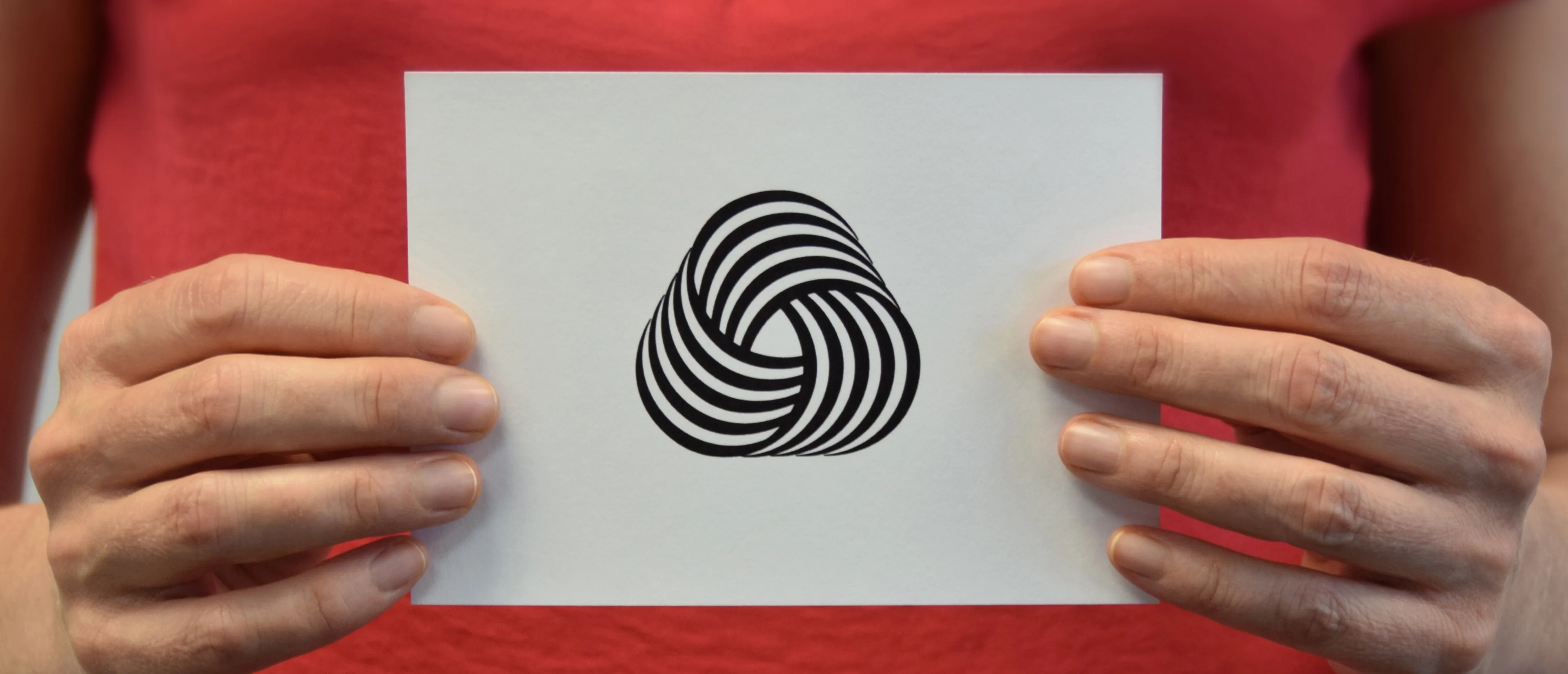
It was on one of the trips that I saw the logo. In a store on Jainty Street, high on a wall above rolls of fabrics, was a big display of the Woolmark sign. I recall standing propped against the counter, tracing the shape with my eyes. The lines traveled in a circle and took me along for the ride. They started slowly, gaining full speed at the turn, then slowing down again before switching to the next segment. It was mesmerizing, like a visual rollercoaster. Suddenly, fabric shopping was not so bad.
Forty years later, I don’t buy wool—I reason that there are plenty of great fabrics that don’t involve animal pain. Yet I still adore the symbol. It’s a perfect blend of simple and unique. Four lines repeated three times in a superb representation of a wool bundle.
In retrospect, my mom never found the perfect fabric. In all the years of tailor-made outfits, I can’t recall a single one with which she was pleased. But I found a perfect symbol to enjoy for decades to come.
The favorite logo goes to:
Woolmark Franco Grignani, 1964
Sometimes attributed to an unknown Franceso Saroglia. Many believe Grignani used the name as pseudonym to enter the logo contest.
— The Pennebaker Team