Creative, Eclectic, Mysterious, Hidden Meanings - what's not to like?

A bunch of us Pennebaker music heads started talking about the best album covers on Slack one Friday afternoon. Within minutes, we realized how subjective "best" was— even "favorite" seemed like an argument between today you and tomorrow you.
So here, in no particular order, are my top ten at the time of writing; tomorrow may call for a whole different list.
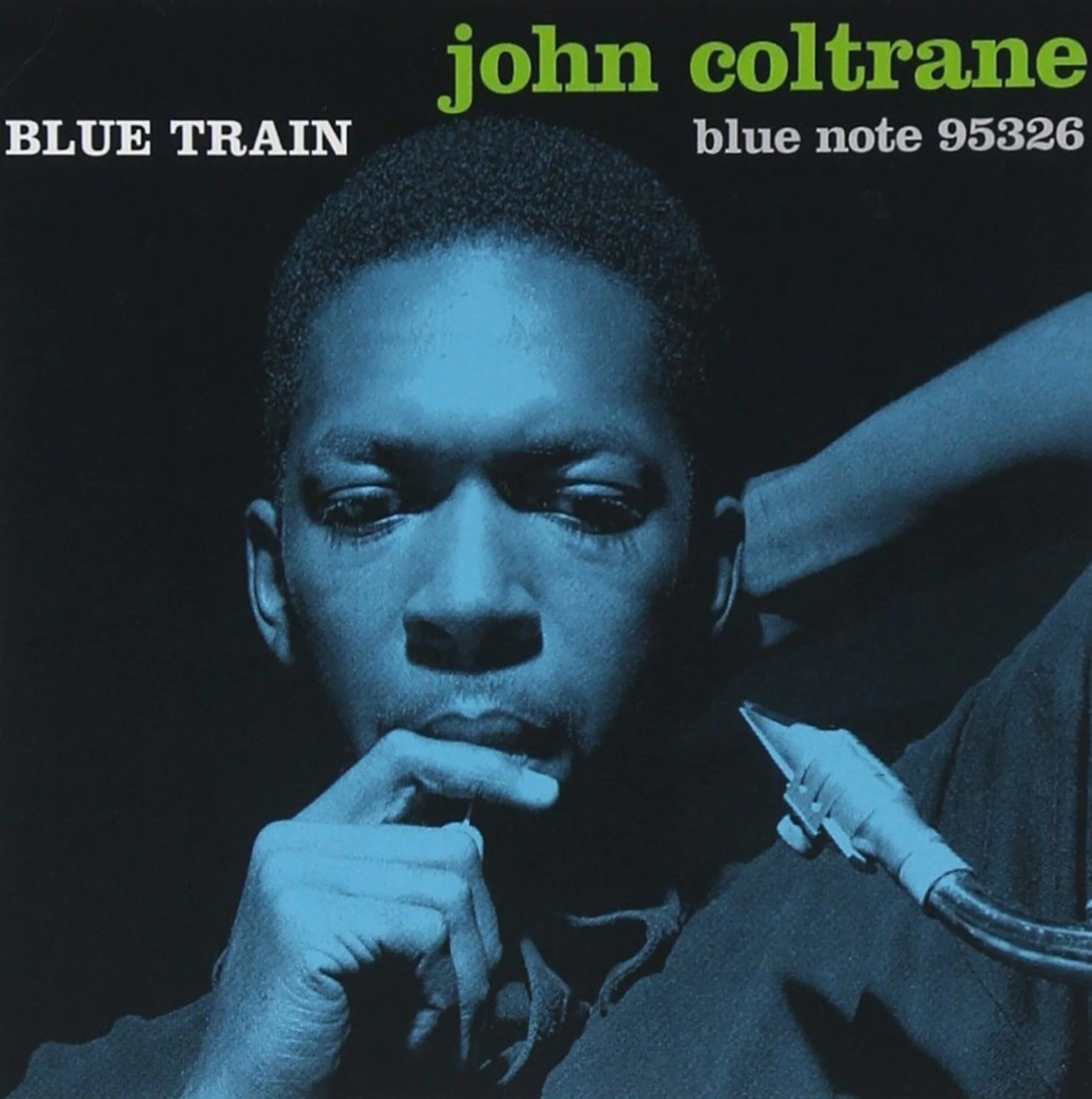
10. Blue Train: John Coltrane
This is a predictable choice for a graphic designer, so I'm getting it out of my system first. It's a shame to pick just one when you can easily make an all-Blue Note list. I landed on this only because it's currently playing in the background.
The visual identity of classic Blue Note releases is as distinct as their sound. The man responsible for it was the other legendary Miles, Reid Miles. In a span of 15 years, he designed almost 500 covers. If you have only one Blue Note record in your collection, chances are, you have a Reid Miles design.

9. Beat Bop: Rammellzee and K-Rob
Owning a Basquiat can run slightly expensive, so this is the next best option. The rare original pressing ranges from $725–14,000. But if you’re like me, just happy to have that art in a big vinyl format, you can find a re-release at one of the online mega stores for more earthbound prices.
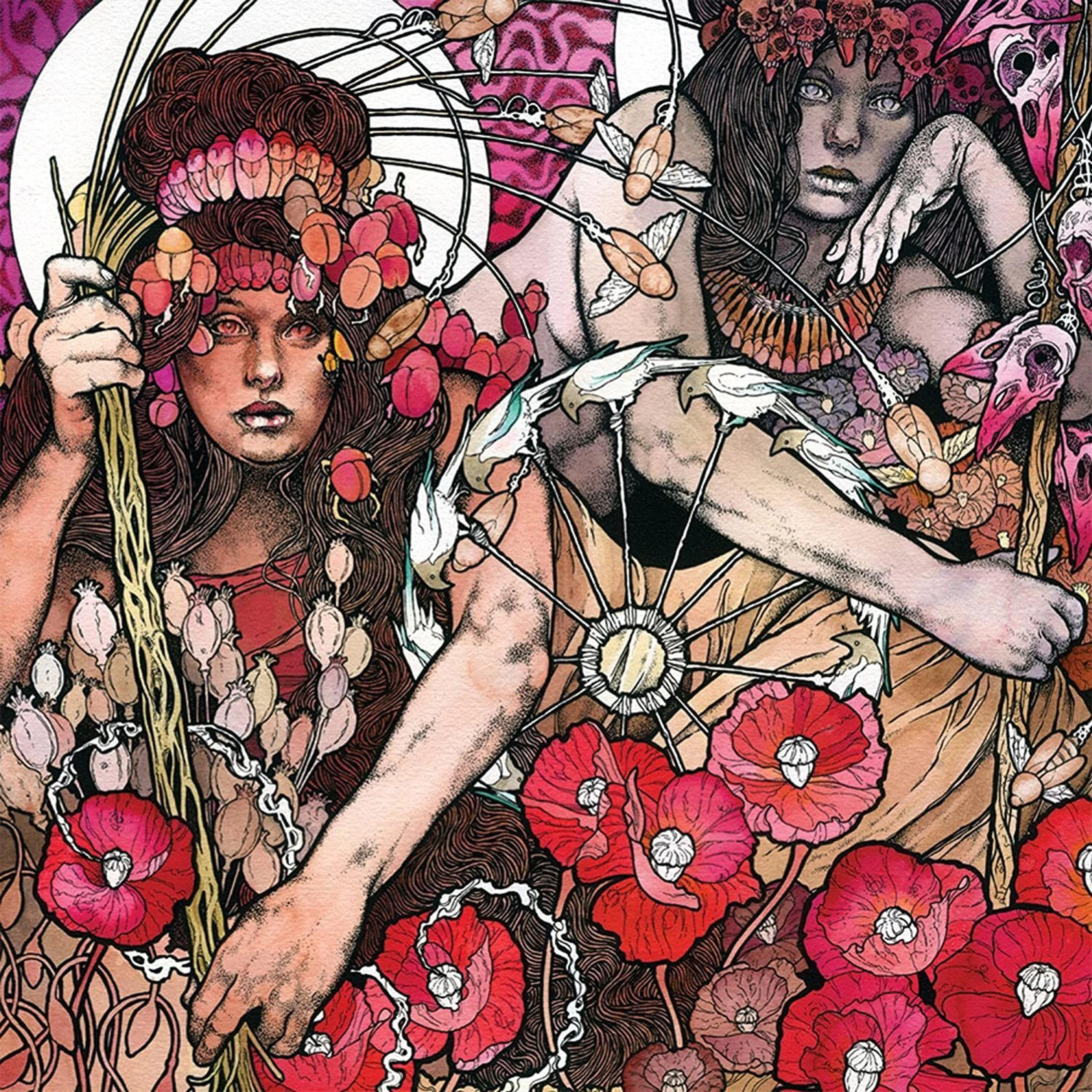
8. Red: Baroness
In addition to his own band, Baroness, John Dyer Baizley’s instantly recognizable art has graced many other artists’ albums. It’s hard to go wrong with any of them, music- or album cover-wise, but I’m partial to Red for how it set the stage for the band’s color-themed musical journey.

7. Random Access Memories: Daft Punk
The music is an homage to the studio-polished sounds of the 70s and 80s; the glossy cover captures the vibe perfectly. The typeface is a nice nod to Thriller.


6. Operation: Doomsday: MF Doom
Another masked musician, another batch of hard-to-choose covers. The original was designed by graffiti artist Lord Scotch, who also designed the famous mask. The rerelease ran into copyright issues, so Doom collaborator Jason Jägel reinterpreted it without losing any of that special something that made the original so memorable.

5. Blackwater Park: Opeth
Prolific artist Travis Smith has designed hundreds of album covers in the heavy music genre. This moody monochromatic design works beautifully with the album that has songs like "Bleak," "Dirge for November," and "The Funeral Portrait." You know, the usual feel-good prog-death metal we all like.
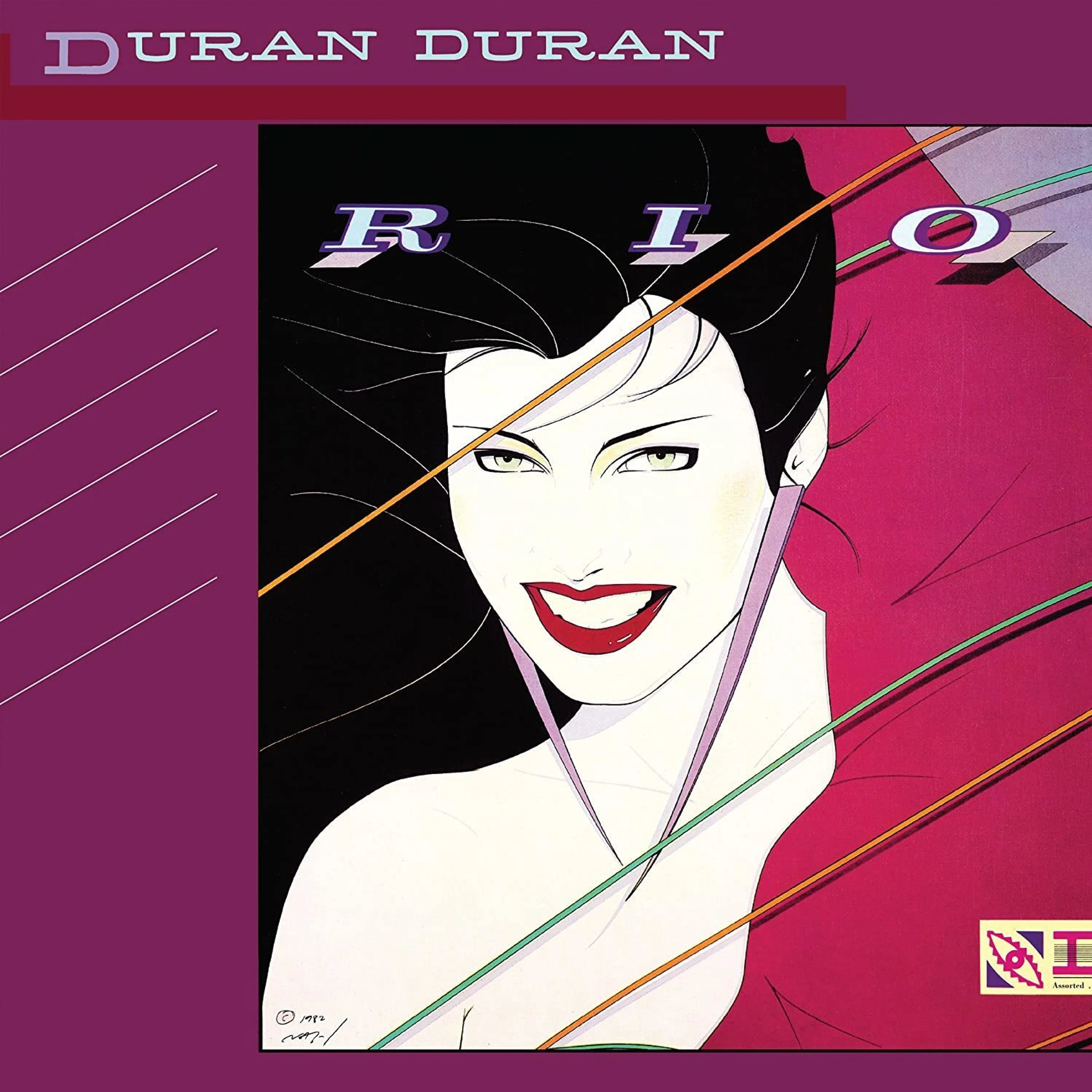
4. Rio: Duran Duran
Patrick Nagel’s illustration became the visual shorthand for an era, a musical style, and the band. For some reason, hair salons all over the world are still rocking this poster. I’ve seen it on three continents…hoping to see more.
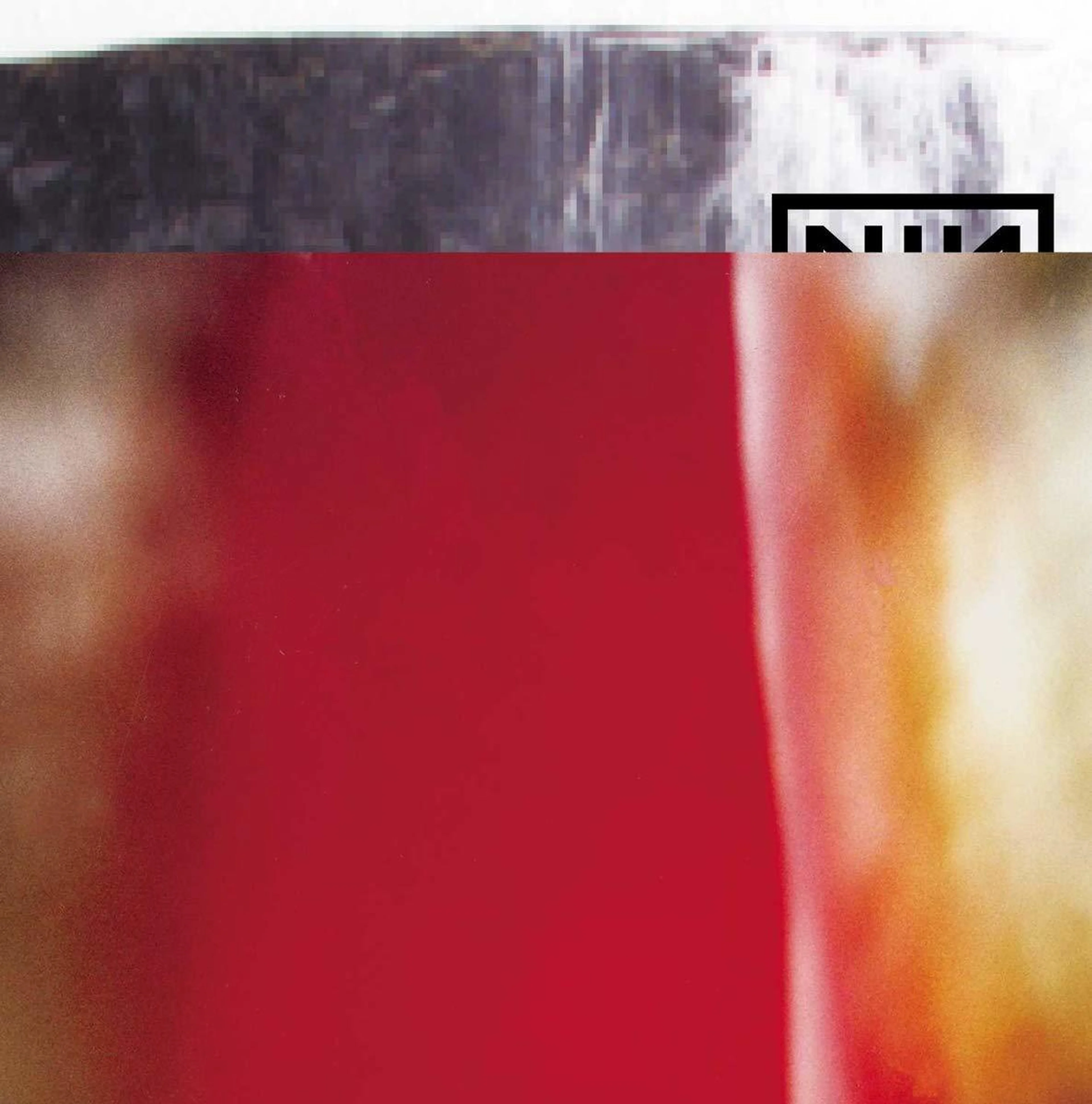
3. The Fragile: Nine Inch Nails
Put charcoal-gray something on top, take out the bottom half of one of the most recognizable logos in rock, then finish off with a big splash of blood-red something. Odd? Yes. Striking? Hell yes.
Designed by legendary designer David Carson, this cover had an interesting journey.
“The back cover was going to be the front until the last moment. Trent changed it saying 'it was kinda irritating' yet something about it we liked so maybe it fit the music. Front cover flowers I shot outside of Austin, Texas. The 1 hour place called and said they messed up and used the wrong chemicals and the film was ruined. I said 'lemme see 'em anyway'. This is how they came out. Cover image is a waterfall in Iceland and a seashell in the West Indies.” — David Carson

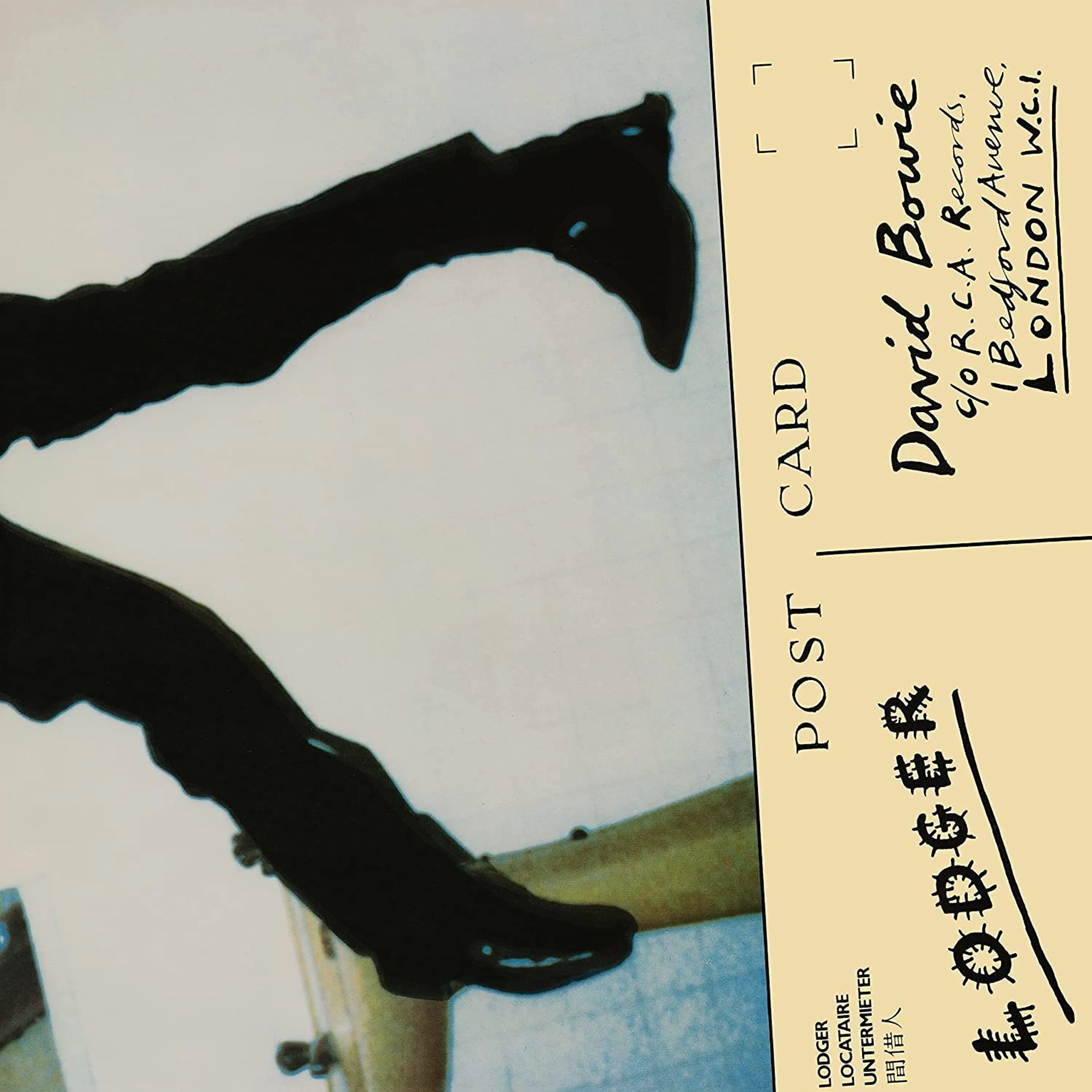
1. Lodger: David Bowie
You can't not have a Bowie album in this collection. His immaculate style, sense of theater, and multiple self-reinventions blessed us with years of great music and visuals. He has at least three iconic era-defining album covers. Still, something about this scratchy low-res cover showing him on a bathroom floor, with a broken nose (makeup) and a bandaged hand (actual burn injury from coffee) does it for me.
— Amol (DJ Bombay)